
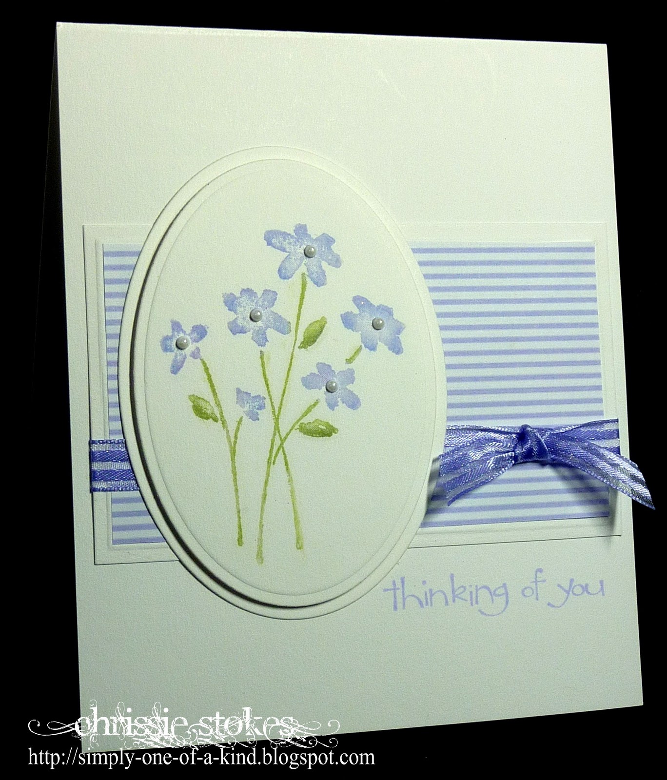
I stamped the SU image with Versamark and then used a cotton bud (Q tip) to add the colour. I used Almost Amethyst, and Mellow Moss with a hint of Sage Shadow.
The paper is from Fred She Said and I coloured the ribbon with a Copic marker as I didn't have any that even approached the correct shade.
The sentiment is from a recent SU Sale a Bration set, stamped in Almost Amethyst ink.
We had the most amazing week at "Less is More" last week, with 231 entires. Wonderful!
If you haven't ventured over there and you fancy the idea of Clean and Simple cards... do pop over and join us... we'll look forward to seeing you there.
Stamping Vacation - Picture Inspiration Challenge
What a beautiful card, as are all your others. I do believe that I have that stamp somewhere, I must seek it out :o)
ReplyDeleteJackie xx
Chrissie your card for this week is beautiful. Love the stamp and layout. I`am learning so much more and less is more though sometimes I still feel as if I lose the plot a bit!! Thanks for all your helpful comments on my blog too. They are very much appreciated. xxx
ReplyDeleteLove this card its stunning, Thanks for running the challenge how friendly is it, Love visiting some of the other entries, Hazel xx
ReplyDeleteHi Chrissie
ReplyDeletelovely card ...they always are ....
hugs
sylvie
xxxxx
Love this card Chrissie, and the pastel colours, just lovely
ReplyDeleteWhat a sweet card Chrissie! I love the soft look of the Poppin' Pastels! I'm amazed that you have had a minute to stamp with all the comments you are leaving! Your Less is More is such a great success!
ReplyDeleteLove the Colour Chrissie and like the stamp very much, all so pretty in pastel.
ReplyDeleteLovely card Chrissie - I saw it on the challenge but hadn't realised you used chalks. I can never get such vibrant effect as this with chalks. Keep up the good work with the challenge.
ReplyDeleteLinbyx
What a gorgeous card. I am so excited I found your site--you have such great taste. Thanks for the ideas using chalks.
ReplyDeleteGorgeous card Chrissie, I am ashamed to say I have chalks and have hardly ever used them... this card has made me think I should have a try.
ReplyDeleteJose x
Beautiful! I'm so glad I found LIM and joined in for the first time this week. I love your stripes and the beautiful pastels.
ReplyDeleteJust Beautiful! Thanks for all the inspiration, Chrissie. I'm loving the challenge
ReplyDeleteI am so behind with my commenting this week Chrissie, sorry chick....
ReplyDeleteLike everyone else I am so glad you created the Less is More challenge, I was never a CAS gal, just couldn't get it right but you and Madi have helped me so much with my fears, thank you....
The way that folks have come together and taken the time to see each others designs is wonderful, it's changed my opinion of the way blogging seems lately. There are people out there who do want to do more than just enter a challenge for the sake of a prize....
Your card is lovely, the balance of the elements is perfect...
Thank you for your inspiration
x
Vicky
wow I adore this creation Chrissie. I'm later this week LOL was away at SECC. 209 enteries this week and you have only this amount of comments!!! this is shocking. Well I really enjoy my visit to tell you how much i love and appreciate your challenge!
ReplyDeleteSee you Saturday
Ali x
Gorgeous card Chrissie, love the delicate colours. Thankyou again for doing these challenges, i,m really enjoying them. x
ReplyDelete