As we have recently cleared the loft in order to have it re-insulated, I came across boxes of fabric which had been in the loft probably since we moved here over 20 years ago. I thought that somewhere amongst it I might have something suitable for this technique, which requires a synthetic, silky fabric. The edges are melted above a candle flame. I set fire to the first piece, so you do have to take care.
I cut out 7 fabric circles using concentric Nesties as a guide for size, and snipped a little way into each one, making 5 petals in each, then I held them a few inches above the candle flame until they started to melt and curl.
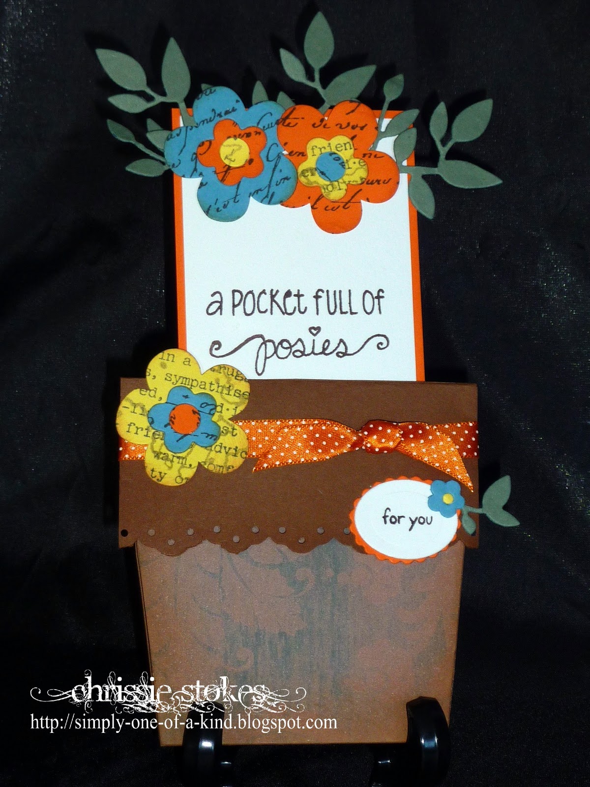
The background stamping is from a Rollagraph , and the leaves are a mix of dies and punches.
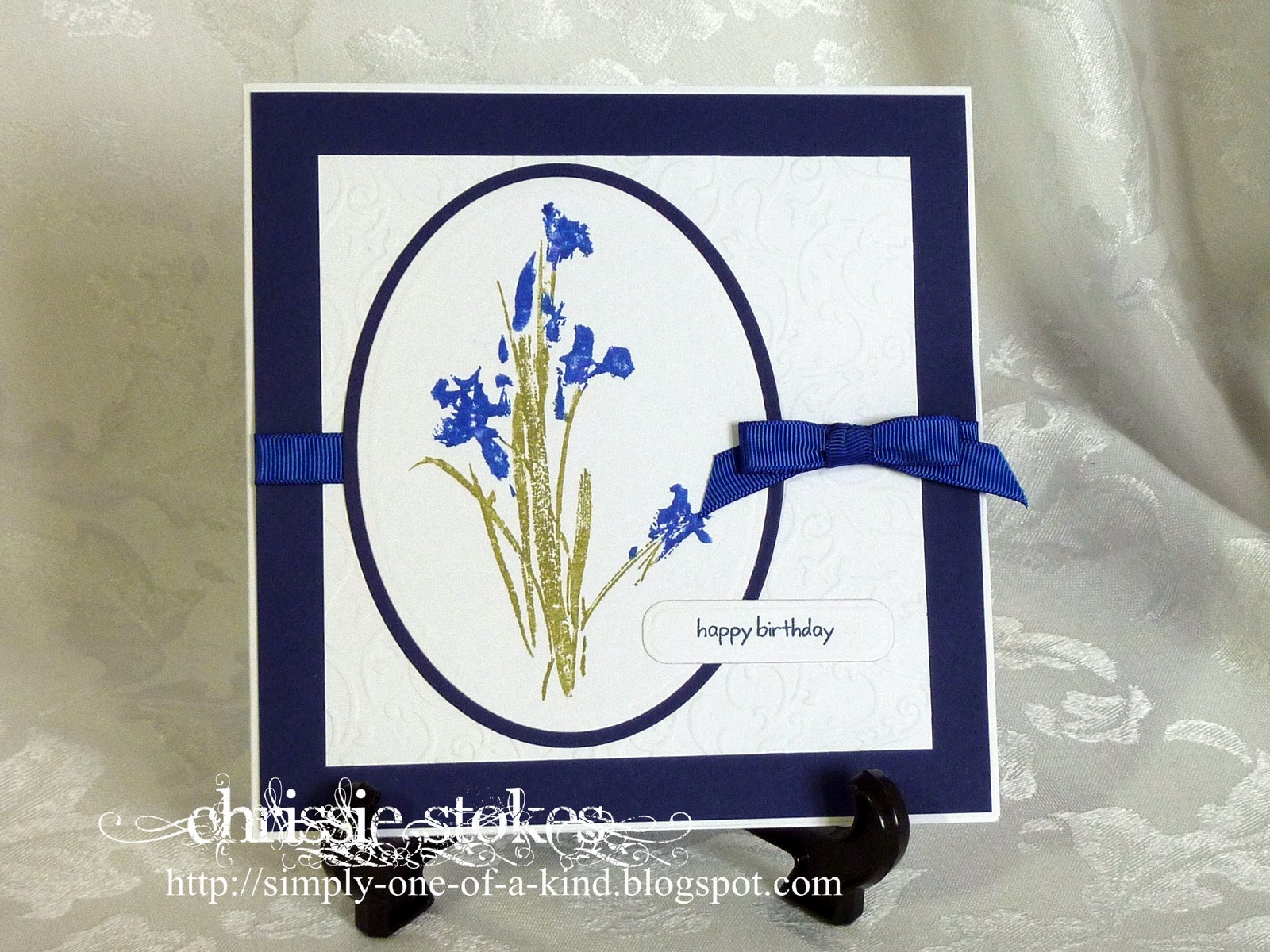
The sentiment is from Stampin' Up.
I don't think it's too bad for a first attempt.