Saturday 31 May 2014

More than one stamp!

I have had an exhausting week looking after my grandchildren, They have been brilliant and we had a super time, but with a different 'mystery' to go on each day, an old girl like me starts to feel her age!
We went to the farm on Monday, Fun City (soft play) on Tuesday, Bursledon Brickworks (Museum) on Wednesday, where they made their own bricks and to Dinosaur Isle on the Isle of Wight, via the car ferry on Thursday. On Friday we took them home!!!

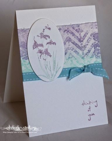
This week at Less is More the challenge is to use more than one stamp. There's no special prize for the person who uses the most, but hopefully it will be fun!
I made a similar card to this a few weeks ago. It involves one of my favourite techniques...emboss resist. The white flowers were stamped with Versamark and clear embossed before the background was inked with Distress Inks and then being overstamped with a variety of plant stamps.
I quite like to chop these panels up once I have stamped them. and mount them in triptychs or similar. The possibilities are endless. This one is simply trimmed with a Martha Stewart Border punched strip and a ribbon.
The sentiment is computer generated in Problem Secretary font.
The sharp-eyed amongst you may notice that the Artemio manuscript stamped strip has been mounted upside down here. It was rectified before it was given to the friend who commissioned it, but that was not until after I had taken this picture. As she is a member of my choir I knew it would be spotted!
The numbers are from an old, retired, US,  SU stamp set. The clarinet is from a colouring site on the internet, coloured with Wink of Stella in black and gold.
Again the sentiment is computer generated in Problem Secretary font.
There are only two examples this week as I've been kinda busy!

Last night I was making some inserts for some wedding stationery, when having almost finished a whole bunch of die-cutting, I noticed that a letter had disappeared from one word in the text and so the whole lot had to be re-printed and re-cut. What a nightmare! 
I hope to have a bit of a rest this week.

Saturday 24 May 2014

Tired or what!

I have just returned from supervising the delivery of my son's furniture into his new home. I was a little apprehensive about his wife's reaction to where I had instructed the men to deposit the furniture etc, but she was delighted with how she found the state of things on her return last night. 
Both my son and his wife are doctors and because the removal took place on a date (brought forward by a cancellation) when both of them had surgeries, they asked me if I could do the honours.
At least now they will have the long weekend to get themselves sorted out.
This next week I have my daughter's children for the half term week. What a lucky granny!
Anyway here are my cards for this week's "Less is More" challenge which is to use a die cut.
This one is mainly Memory Box... it's mainly die-cuts too!
The rectangular panel is called LucienneTile, the butterfly is made from Moonlight and Kaleidoscope butterfly dies, the sentiment is die-cut with a Spellbinders D-Lites Fancy labels Tag 3 die, mounted on an oval die the make of which I don't remember. Neither do I remember the make of the unmounted sentiment stamp!

Lots more die-cutting here. 
A Dienamics butterfly and a Tattered Lace sentiment. I have to use a few shims with these TL dies, as getting a really clean cut is quite difficult. I always add DST to the back of my card before cutting out with fiddly dies, as it makes adhering them to the project much simpler. Merely peel and press.
I probably won't get much card-making done this week, but we'll have fun. I may need a really long rest next week!
I used these super cute ladybird dies (thanks Chrissie!! I had to buy them after seeing you use them) and paired them with the hello word die from Clearly Besotted Stamps. The background uses the circles from the Geographic 2 set and it's finished off with a little enamel accents.

 
This is a little shadow stamping... (I thought I ought to have a little stamping somewhere) framed with a die-cut oval!
The stamp is from Unity, the sentiment from Hero Arts! 
Another Memory Box rectangle die... Ringo Tile this time, paired with the Chloe flower head and a tattered lace sentiment. The Green card is all twinkly IRL! Such a quick card to make.
I do hope you'll join in with us this time, I'm sure I'l spot some dies that I just have to have!

Monday 19 May 2014

Totally Excited

When I saw this sketch at CAS(e) this sketch....
...the hexagon made me think of chicken wire, the chicken wire made me think of chickens and chickens made me think of Penny Black. SO... here is my card made with Penny Black's 'Totally Excited' stamp, given the same sentiment in a font (Thuphap) that I just discovered via another blogger. I think it suits this image brilliantly.
The little hearts are from Clearly Besotted's Fancy Feathers.
The hexagons are Framelits and the chicken wire die from Cheery Lynne.

Sunday 18 May 2014

Ahoy!

I must apologise for this dreadful picture, but I was trying to avoid half in sunlight and half not! Once I had taken the pic, my computer refused to recognise the fact that I had inserted the SD card.. I hate technology when it doesn't do what I think it should!
This is for CASology's Splash challenge!
The whale and the lighthouse were cut on my Portrait!  Once the pieces were coloured and assembled, I covered them with Anita's3D glaze. was embossed with a bark embossing folder, I think it looks quite realistic as surf!
Keep it Simple had the theme of Maritime so it's for that too!
The sentiment was computer generated!

Saturday 17 May 2014

CAS on Sunday!

has this little sketch to follow this time.
I made the little eye test chart which spells out Happy Birthday and added the specs which are from a die cut! In reality they look like quite a reasonable tortoiseshell effect.
It was fun to make.

Flowers

Quite a lot of the cards I have made this week would fall in to the category for this week's challenge at "Less is More"!
It's Flowers!
However here are a couple ... needless to say one is water-coloured!

It's not a great picture, but I really enjoyed water-colouring this image from Clearly Besotted. This particular floral collection lends itself really well to water-colouring techniques.
Here I stamped with Versamark and coloured with Distress Inks. The sentiment is from Gina K Designs.
Because watercolour paper is an odd shade, it doesn't lend itself to mounting on either white or ivory card, unless it's completely covered in pigment... hence this is mounted on blue which has been dry embossed with a manuscript embossing folder.
This is one of my favourite floral dies... it's such an elegant poppy image!
The edging is die-cut with a Marianne die.
Last night we went to a supper with friends who were raising funds for MacMillan cancer care. It was great fun, a lot of work for the hosts but a wonderful amount of cash was raised for the charity. It's such a great way to make money for a really good cause! 
Today I'm going to see my son's new house for the first time...I shall be supervising the removal men delivering the furniture on Wednesday... they managed to fit the delivery in at short notice, but my son has a clinic in Worthing and his wife has patients to see in Bury St Edmunds and so neither can be there! Could be a recipe for disaster, so wish me luck!

Thursday 15 May 2014

Yet more watercolour


I'm still beavering away at watercolour techniques...some more successful than others I must admit. This one I was quite pleased with. I decided to clear emboss a Versamark image of this Clearly Besotted stamp. I then proceeded to use 3 shade of red Distress Inks. I began by floating in a Victorian Velvet, then added some Worn Lipstick and finally Festive Berries.
For the leaves leaves  I used Bundled Sage and Iced Spruce. I cut the top part of the flower with the matching die, before putting the paper through the Cuttlebug with a Spellbinder's Circle. I quite like how the top part of the flower is defined by the partial cut.
The sentiment is Penny Black!
This one is a Stampin' up image minus its sentiment. Not my finest water-colouring but I learned a few lessons whilst doing it. This again uses Distress Inks. The deep pink shade this time is Picked Raspberry! The greens are Shabby Shutters, Peeled Paint and Forest Moss!
I used the sketch from Freshly Made Sketches

Tuesday 13 May 2014

More Watercolour

This is the sketch from Stamplorations (reversed)

I have been trying a few more things with watercolour. Here I used a poppy head stamp from Clearly Besotted's Remember set which arrived today. I water-coloured it with Distress Inks.
I found it really rather restful to sit and paint away, I'll have to try a few more of these.
Simon Say Stamp Wednesday challenge - Flowers
Keep it Simple - Watercolour
This one was done with a Hero Arts watercolour stamp again using Distress Inks, with a little touch of Wink of Stella on the petals The sentiment is from Tattered Lace.
This one shows rather too much shimmer. It was water-coloured using some Perfect Pearls in the water.
The sentiment is from Simon Says Stamp.

The last one was really difficult to photograph. I apologise for the dreadful picture, but I used some Perfect Pearls in the water for my watercolour paint and all I was getting was the sheen and no colour!The image was embossed with white fine detail embossing powder. The sentiment is from Lili of the Valley.

Monday 12 May 2014

Online Watercolour Class

Late as usual, I joined in the Online Watercolor (as it is spelled over the pond) class.
I really like learning new techniques and watercolour is something I really like. I took a class on a cruise not too long ago, although I didn't learn a whole heap on that.
Anyway, the first lesson was to make a watercolour background.
This one was done with a stencil. I made this stencil out of acetate, using my Portrait machine during the last online class I took.
I shouldn't give too many secrets away as the class is still live and it wouldn't be fair to the teachers who worked so hard to put the sessions together.
For this I used Distress Inks in Tumbled Glass and Dusty Concord, however in order to get the shades to match on the stamped flower I had to use completely different media... I used a Marvy Plume pen for the leaves and an SU marker for the petals. (The original Distress Inks would have turned out far too dark for my liking when stamped!)
The stamps are from Penny Black.
This is another variation on the same theme.
Again another stencil made on my Portrait.
Here I used Shaded Lilac and Dusty Concord Inks.
'Hello' is from Clearly Besotted and the butterfly from Memory Box.

Saturday 10 May 2014

New Laptop!

My tedium at the wait for things to happen on my laptop got the better of me and I succumbed to buying a new one. The problem now is getting to know about new versions of Windows and Office!
I may be some time!
Before I embark on the new one, I thought I would try to get this post sorted on my old one... where I vaguely know what I'm doing!
Here are my cards for this week's Less is More challenge, which is a ONE LAYER thank you card.
This first one uses a Lili of the Valley sentiment stamp, together with a Tim Holtz  floral spray.
I stamped the sentiment with Versamark and embossed with Brushed Corduroy Distress Embossing Powder. I thought that this would suit the  style of the font. Then I stamped the spray with  regular Brushed Corduroy Distress Ink.

Here I used a couple of Stencils from Memory Box. The Distress inks used were Shaded Lilac and Chipped Sapphire for the flowers and Iced Spruce and Bundled Sage for the foliage.
The sentiment is from Simon Says Stamp.
The grasses are stamps from Inkylicious.
I quite like the watercoloury effect!
This is also for a couple of other challenges
One Layer Simplicity - Fabulous Flowers
Addicted to CAS - Off the edge
My son has finally exchanged contracts on his new house... he can't wait to move it, but will have to wait until the furniture removal company can fit him in! Hey HO! 

Saturday 3 May 2014

Take three colours

Our colour challenge at "Less is More" this week is to use three different colours or three shades of the same colour.
This first one uses grey, red and black.
The little digger is a file from Bird's Cards, cut on my Portrait machine. I used white card, coloured the sections with Copics and then glazed them with Anita's 3D Glaze once assembled. The scoop section was fixed with a brad so it can move up and down! The splats are from SU's Gorgeous Grunge stamp set.
The sentiment was computer generated!
This one, using the sketch from last week, employs die cuts from Cheery Lynn, inked with Shabby Shutters, Peeled Paint and Forest Moss Distress Inks. The embossed veining on the leaves is really effective. 

Today we are going to a singing day working on Bach's B minor Mass. It's such a super work and it's a while since I sang it, so it should be fun!

Friday 2 May 2014

From a potato!

The new Challenge at the Craft Stamper's Blog is to produce a card using a stamp made from a potato. 
This takes me back to the days of my youth... doing it as a child and then more latterly as a teacher cutting spuds for the kids to use for printing at school... in either case it's a while since I did it.
Here is a little card which funnily enough would be quite appropriate to give to a teacher at the end of a term!
The main image was inked with Distress Inks in several shades of red. The background strip was simply stamped over and over... it seemed to retain the colour for each successive stamp!
Why don't you have a go!