Friday 30 September 2011

Playing around with dies


The two die cut elements on this card are a far cry from their original counterparts. I made the die-cut for the flower a little longer and the die-cut for the ribbon slider tag, shorter.
Here you can see the dies I used compared to the die-cuts they produced.
I have done a brief tutorial previously on how I do this which you can see here.
It's merely a question of cutting the card first from one end, (only allowing a proportion of the die to pass under the rollers of the die cutting machine) and then the other, repositioning the die and turning around the card, after the first cut.
I have found this a really useful technique as it means that lots of my dies can be used far more extensively.
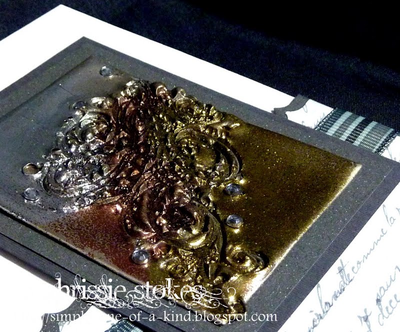
This Imaginations image wooden stamp was sent to me as a bonus from a US eBay seller. Wasn't that kind!
The sentiment is from Stampin' Up and the embossing folder is from Cuttlebug.
We managed to eat in the garden yesterday for only the second time this year and it looks as though we'll manage to do the same again today... what a beautiful touch of Indian Summer!
CASual Fridays - Use Ribbon
I have just replaced the first image with the revised card including the loops of ribbon... I think the change has improved it  enormously... thanks CASual Fridays!

Thursday 29 September 2011

Could it be a penguin?

Here we go again, bird #3!
A slight rotation of the stamp and a couple of different colours and now we have a penguin... a rather chubby one it must be said!
The feet are part of the leaf spray from the SU bird punch. His wing, which you can scarcely make out in this picture was cut from another stamping of the image. One of these days I'll use this stamp as it was intended... as a leaf!
The background is from a Cuttlebug EF, using the debossed side and the sentiment is from Butterfly Kisses.
I'm trying a new semi-matt embossing powder which I have just bought. I have used it on the penguin as I wanted to make some difference between him and his background... I thought it might be useful for my inky projects too... I'll let you know how I get on.
Stampin' Royalty - K.I.S.S.

Wednesday 28 September 2011

How about a chicken?

Well you saw the robin made with this leaf stamp from Paper Artsy a couple of posts back.... how about a chicken?
Here she is, stamped using Tea Dye Distress ink with a wattle and comb added with a Copic pen and a little wing made from one end of a leaf shape cut with a circle punch.
A couple of strokes with a Copic pen for her legs and a black gem for  her eye and she was away pecking for corn! The sentiment is a clear stamp from Personal Impressions.
I think it's fun to see what you can make from your stamps.
The vertigo persists so I shall keep on with my manoeuvring!
Crafty Creations - Clean and Simple

Tuesday 27 September 2011

Autumn

Here's another of the cards I like to make messing about with inks and embossing powder.
The stamp set I used is French Foliage by Stampin' Up.
I began with the splodges which I stamped with Versamark and embossed with clear EP, then came the sponging using Adirondack Cranberry and Caramel Inks, followed by the stamping of the leaves and text in a variety of autumnal coloured inks.
I then chopped the square panel into 4 smaller squares, inked the edges of each and mounted them on a couple of backing sheets. I decided to add one wayward leaf, just floating off the square.
I love these colours.
Today I have a touch of vertigo... I tried to do the Epley manoeuvre myself and made it worse, so I'm off to see the doctor this afternoon.
Crazy 4 Challenges (I don't really do Halloween, so this is Autumn)
House of Gilli - Fall
Woodware USA - Fall
Crafty Catz - Autumn

Monday 26 September 2011

Little robin


I was looking through my stamps this morning and came across this little leaf stamp from Paper Artsy! I know it's intended to be able to be used as a bird too, but I thought that it was perfect for a robin. I inked it with Distress inks in Barn Door and Vintage Photo  and swiped the two lower square mounts with Fired Brick and Aged Mahogany inks respectively. Sadly the deep red of the Aged mahogany doesn't show too clearly on this picture.
The sentiment is part of a stamp from Papermania, stamped with SU Soft Suede. I really don't care for stamping sentiments using Distress Inks as they tend to bleed a little.
The robin was completed with a couple of strokes with a Copic pen for legs and a small black gem for his eye.
CASual Fridays -  Monochrome + brown.

Sunday 25 September 2011

Simple butterflies

I was experimenting with inks to see what colours looked well together and rather liked this combination. It's Dusty Concord, and Milled Lavender Distress inks plus Rich Razzleberry from SU. 
I swiped the section which I cut off  the A4 sheet when making this card, with a small section of each of these colours. Then I simply used my SU Embosslit to cut out and emboss the butterflies.
 Double mounted on more scrap card, popped onto 3D pads and embellished with two tiny pearls on each and the card was finished. I've since made another of these cards using different inks, adding a computerised greeting first of all.
Quick and easy!
I'm still recovering from last week's marathon commenting session at "Less is More" (782 entries) Phew!
My Time to Craft -  L is for- Lepidoptera  (Butterflies)
Allsorts - Clean and Simple

Saturday 24 September 2011

Sketch - Less is More

Here is a super little digi image from a Day for Daisies, which I have used for the sketch at "Less is More" this week.
Coloured with Promarkers and using some additional Paper Artsy stamps, it's a simple one layer card.
Last week was simply amazing... we aimed for 1000 submissions and remarkably, very nearly made it! The industry of so many LIMettes was truly astonishing!
The stamp Man - Perfect Pear
This one is a reject as it didn't really come off... the idea was there, but the execution of it missed the mark... the colour of the card for the image is too far removed from the kraft card and should have been inked a little I think... but I wanted it to match the ribbon, which is why I left it. I may revisit it later.
This little robin has been recycled from an old Christmas card... there were originally 5 robins on a card and now there are 5 cards with one robin on each!
I commented on nearly 800 cards last week... quite a challenge in itself... but what a wonderful effort from all our loyal LIMettes and some potential new ones.

Sunday 18 September 2011

Clean and Simple 158

I've been kinda busy commenting on entries to "Less is More" since yesterday, as we are trying for 1000 submissions to our CAS challenge, since we now have over 1000 followers. LIMettes are trying really hard, I must say.
I took a quick break to make a card and this is what transpired, following the sketch from Clean and Simple 158.
The house is cut from a series stamped with my Stampin' Up wheel and coloured with Promarkers. The sentiment is a clear stamp from Studio G. The embossing is from the Lattice folder from Creative Expressions.
Clean and Simple  158. Sketch
Dutch Dare - Monochromatic

Saturday 17 September 2011

Anything CAS Goes at "Less is More"

This sweetie of an image is a digi  from A Day for Daisies, I think that these little guys look decidedly cute. Simply coloured, it needs little else besides a simple greeting.
Totally Papercrafts - Clean and Simple
I thought I would support the challenge sponsored by my chum Mandi this week!
This one is another simple design using Stampin' Up stamps. The vase is made from a bauble stamp, the base part of it was masked with Selotape before inking which I removed before stamping with Versamark and then embossing with fine detail gold embossing powder.
It was punched out with the SU bauble punch and the the excess at the base simply snipped off. I like it when stamps can be utilised in different ways.
 
Although I have several digi images very similar in style to this one, this is in fact a stamp. Again it is simply coloured with distress inks, applied with a water brush.
Each of these cards is exactly the same layout, but each looks slightly different because of the shape and presentation of the images.
This week we are trying to see if every follower of "Less is More" could submit to our challenge, which would make over 1000 entries... regular contributors will probably helps us on our way by entering more than once, but it will be interesting to see how many submissions we get.
Why don't you join us? Anything CAS Goes!

Friday 16 September 2011

Small baby?

A very small card with a very small greeting for a very small person!
This card is just 4ins square and simply has a small image and a small sentiment. Stamped in Memento Tuxedo black and coloured with a couple of Promarkers and it was done.
This week has somehow disappeared without anyone telling me where it went and today to top it all,  I forgot my Aqua exercise class. Is there hope for me? I seem to have been busy, but I don't know what I've actually done.
People are still finding some problems accessing my blog, some browsers working better than others it seems. Internet Explorer seems to have worked the most consistently although there seem to be fewer people using that these days.
What to do about it is a complete mystery to me, I can only hope it sorts itself soon.
OLW - Coloured image
Casual Friday - 4 in CAS card.
Alphabet challenge - Q - Quick and Simple

Saturday 10 September 2011

Seeing Double at "Less is More"

It's a One Layer Card week at "Less is More" and from somewhere or other Mandi and I dreamed up the subject Seeing Double. Sometimes thinking of the themes is a lot easier than actually carrying them out. I had lots of ideas for my samples this week before realising that some of them weren't actually One Layer!
This is the first card I made with my lovely, small pear stamp. The method I used is on the challenge blog.
This one uses the medium sized pear, it's really quite fun to colour the stamp before making the impression. As I mentioned on "Less is More", these stamps are absolutely flat with no texture whatever etched into them, so any interest comes from the inking.
This one, although not for the challenge at "Less is More", was my first attempt at adding dimension to the stamp, merely by inking.
I am submitting this one to Sir Stampalot's Monthly Challenge   'In the frame' as this is where I bought these fabulous pear stamps. I've made quite a mess of the wooden blocks when trying to get the darker colour around the edge of the image with my ink pads. That doesn't worry me overly however, as I'm not that fastidious.
The last one is merely a double stamping without re-inking in between, to give the impression of a shadow.
Thank you to all those people who visited and tried to leave comments for me last week when either my blog or Blogger were being unco-operative and not allowing comments from some people to be left. Thanks for trying!
Have a lovely weekend, my husband and I will be singing in a 'Prom' type concert is a nearby village tonight. They are raising money for a Macmillan Hospice, a most worthy cause. I'd better go and take another look at the music.

Friday 9 September 2011

Beautiful butterfly

Last week, Margaret, a participant  in our Clean and Simple challenge "Less is More" submitted a card where the letters were embedded in the embossing and I thought it looked super. I've tried it here, using die-cuts from my Cuttlebug Typewriter alphabet and a Stampin' Up embossing folder.
One thing I wasn't really prepared for, was how much the card shrinks in the process using this particular folder. Having cut the strip to size I had to reduce the size of the card to accommodate the smaller dimensions of  it, once embossed.
Having looked again at Margaret's card, I realise that she didn't quite use this method... she used some letters as a mask and inked the embossing folder... but her cards gave me inspiration anyway! DO take a look at her fabulous work.
This gorgeous splash butterfly is from Indigo Blu and I love it.
I've been doing lots of experimenting with photographing mainly white cards and I haven't cracked it yet, despite trying to enhance the pics in Picasa... sorry about this one.
I 've just bought a couple of sets of Grand Nesties and as yet haven't come up with a storage solution. I keep my regular thin dies in stacked CD cases, which I find really convenient... but the Grand ones are a trifle mega.
Any suggestions?
Just Add Ink - Whisper White + one other colour

Thursday 8 September 2011

CASE...Copy And Selectively Edit?

This week on "Less is More" one of Blogland's shining star crafters submitted a fabulous card which I just had to CASE.
She and I have the same taste in stamps I think, as French Foliage from Stampin' UP is a firm favourite of us both. Her name is Vicky, I'm sure lots of you visit her already and you can see her card here.
Her blog is full of inspirational ideas and we can all learn so much from her.
I hope you don't mind me case-ing your fabulous card Vicky!
The tiny tags are Cuttlebug and the heart is SU. The sentiment is from Hobby Art.
Little Red Wagon - Use Die-cuts

Wednesday 7 September 2011

OLW 63 Baby Card

It's great to see OLW back and here is my contribution !
A tiny card with a tiny stamp for a tiny person. 10cms sq. (about 4ins sq)
The stamp is Inkadinkadoo, embossed in silver and coloured with Distress inks.
One Layer Wednesday 63 - Baby Card

Summer holiday memories

This card uses another of Arielle's images from  the Wax Fruit Company, I love her trademark frames with a little of the image escaping! This has been simply coloured with a few Distress inks and a touch of Promarkers. The sea has been gently twinkled with Glamour Dust.
I used a Stampin' Up sentiment, which seems to suit the image really well.
I don;t know if the problems with my blog which were apparent yesterday are still in evidence, but it was most strange how some people were able to comment whereas others found they couldn't. My widget which counts visitor numbers also appears to have gone AWOL.
I had switched to the new Blogger interface but have now switched back to the old one... I'm not sure if that was the problem or not, I just hope things sort themselves out soon.
Thank you everyone who emailed me to let me know of the problems. It was much appreciated.
Crafty Cardmakers - Summer Holiday Memories

Tuesday 6 September 2011

Bad Blogger

It seems that some people have found that they cannot comment on my blog.
Yesterday I began using the new interface and altered a few settings... I don't know if this is the cause of the problem or merely a Blogger glitch.
If you find that you cannot leave a comment, I would be really glad if you could email me to let me know, so that I have something to work on. 
Some comments are being allowed so it's very strange.
Thanks so much.
Chrissie

From Russia with love

A friend from choir gave me a list of cards he required for the coming months. Among them was an Anniversary card. He will be spending his wedding anniversary in Russia and wanted a card for his wife which somehow reflected this.
I thought that this image was redolent of the spires in Moscow, so I hope it will be suitable for him.
The main panel was embossed with a SU embossing folder and the sentiment was made on the computer. A little diamante embellishment on the ribbon and the card was complete.
Casual Friday - Clean and Simple with film or TV as inspiration and the colours red, white and black.
Your Next Stamp - Song Inspiration
From Russia with Love!

Monday 5 September 2011

A (Christmas) Day for Daisies

Since the inception of  "Less is More", I have found that I have less time to enter other challenges, as commenting on all our entries is quite time consuming. In the interim I have also become even more of a CAS kind of gal and on looking at lots of challenges now, I find that my style is far removed from what lots of challenges are requesting. However there are two here which seem to fit my bill...
A Day for Daisies - A bit of a holiday and a bit of red.
Clean and Simple - Sketch
Anything Goes - Film, TV Inspiration (White Christmas)
Stamp Something - September Digi Day
This super little chap in his stocking was the free digi from ADFD, as they require one of their images for their challenge. I think he's the cutest.
I'm trying out the new interface for Blogger... all's well so far, I've yet to discover the extent of its capabilities.
Have a good week!

Saturday 3 September 2011

Something Metallic - Week 31 Less is More

The topic this week for submissions to our challenge at "Less is More", is to have something metallic on a card. This could be any form... card, ink, embossing, charms, actual metal (there are many forms of hardware type embellishments for cards these days it seems). It will be interesting to see what people can dream up.
This card has a topper which has been triple embossed and stamped with  a flourish from the Stempelglede Grunge Hearts set of stamps. Details of how it was done are on the challenge blog.
The paper is from Pink Petticoat and the sentiment from SU.


This close up shows how deeply etched the stamp was... it gives a super texture.


The second card I made uses some metal foil. I'd bought it long ago in Bury St Edmunds when visiting my son... there's a great little shop there called The Stamp Hut and every time I visit, I have to just pop into the shop! They stock some lovely goodies and are really helpful and friendly! Do check out their website.
Once more, details of how this was made are on the "Less is More" blog.

We went to see 'Singing in the Rain' in Chichester the other day. It was wonderful, I found myself smiling most of the way through. The dancing was wonderful and I was glad that we weren't sitting in the front rows as the people sitting there got SOAKED! It was such fun and I think that it was the first time that I've been at that theatre when there was a spontaneous standing ovation!
Have a wonderful weekend!

Friday 2 September 2011

Craft Stamper - Take 2

Whoo Hoo!
Sneak Preview...
Page 38,  October issue, Craft Stamper Magazine.
I'm there again!
Check it out to see the whole card.