This week at
"Less is More" it's time for another Colour Challenge and this time we have chosen Blue & Green.
I think it's a great combination and I made several cards playing around with the colours.
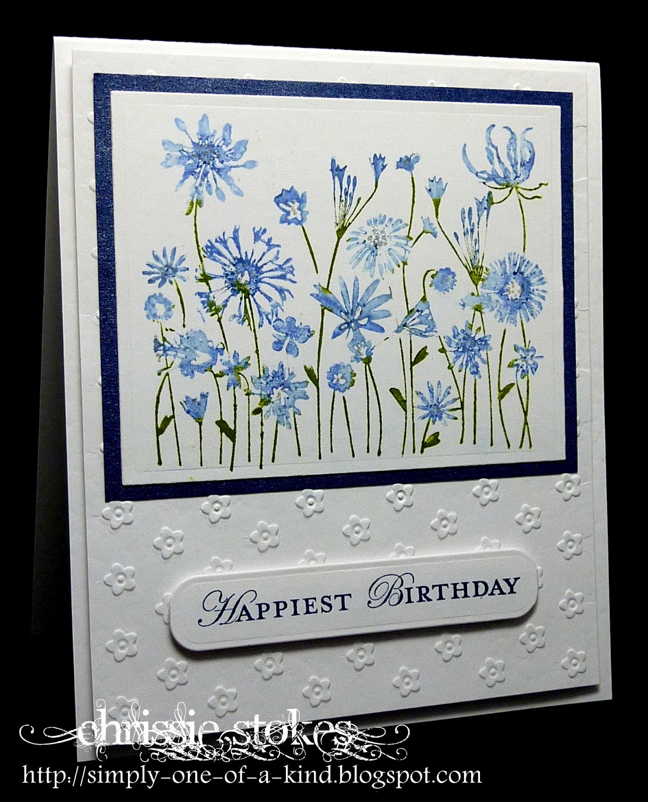
This one is a Hero Arts Stamp, which I coloured with Stampin' Up Markers. I added a few accents with a Sakura Clear Star pen, but these don't show up too well on this picture. The sentiment is from SU mounted on an extended Spellbinders tag die. I'm not sure of the make of the embossing folder.
I love this technique for adding interest to a background stamp. I used a gorgeous, negative flourish stamp from WOW Embossing Powders, inked using Versamark, then when stamped, sprinkled with a few pinches of WOW Blueberry embossing powder, followed by a few of Green Shimmer, tapping off the excess between each application. Finally the whole of the image was covered with Clear Gold Highlight powder, then heat embossed.
I sponged a little more Versamark around the edges of the panel and then heat embossed it using Gold Sparkle powder. The hearts were stamped and the edges embossed also using the Gold Sparkle powder.
The sentiment, also from WOW, was stamped using SU Night of Navy.
The colours used here are SU Lucky Limeade and a mix of blues... Bashful Blue, Pacific Point and Night of Navy. Each stamping was sprinkled with Clear Hologram embossing powder, to both set the ink and add a little depth to the colour.
For the tiny panel on this card I began by inking some card with Lucky Limeade ink using a Duster Brush. When dry, this was followed by stamping the Indigo Blu image in Versamark and clear embossing it. The blues were then dusted over the top using Pacific Point and Night of Navy. After choosing the section I wished to die cut for the panel, I used some of the excess to die cut the butterflies with the SU Embosslits die.
Finally a very simple Simon Say Stamp/Memory Box die-cut flower with a double layer for the petals to give dimension and a Hero Art sentiment. Simples!
Have a great weekend.