Saturday 25 August 2012

3 - 2 - 1 at Less is More

Here is an embossed panel made with 3 different Embossing powders over a Hero Arts background stamp.
There are 2 framed squares and 1 Memory Box diecut flower. There are also 3 gems. 
I decided to use this particular die as it seemed to match the background well. It matches so well that you can hardly tell the difference between the two!
Here we have a 3 word sentiment, 2 hand prints and one ribbon.
We're all in the pink this week it seems
.Here is another piece of that 3 powder background embossing, with 2 squares and 1 butterfly (which also has three pearls embellishing it).
I apologise for the cyclostyled comments last week, but I was on a cruise on the Queen Victoria to Norway, where Internet coverage was a little spasmodic... but what a wonderful week!

Saturday 18 August 2012

Tearing around at Less is More

Our theme this week at "Less is More" is 
TEARING!
This can be really effective, but trying to get it looking just right can be problematic at times.
I used my new Dienamics tree die for this one and used the leaf dies a second time to make the little bird. I dragged a Distress ink pad across the card after cutting, as this leaves a great effect on the embossed die-cut.
The grass was torn from a couple of pieces of card, one of which I ran through a Sizzix embossing folder and  highlighting the raised parts with Bundled Sage Distress ink once more, directly from the pad.
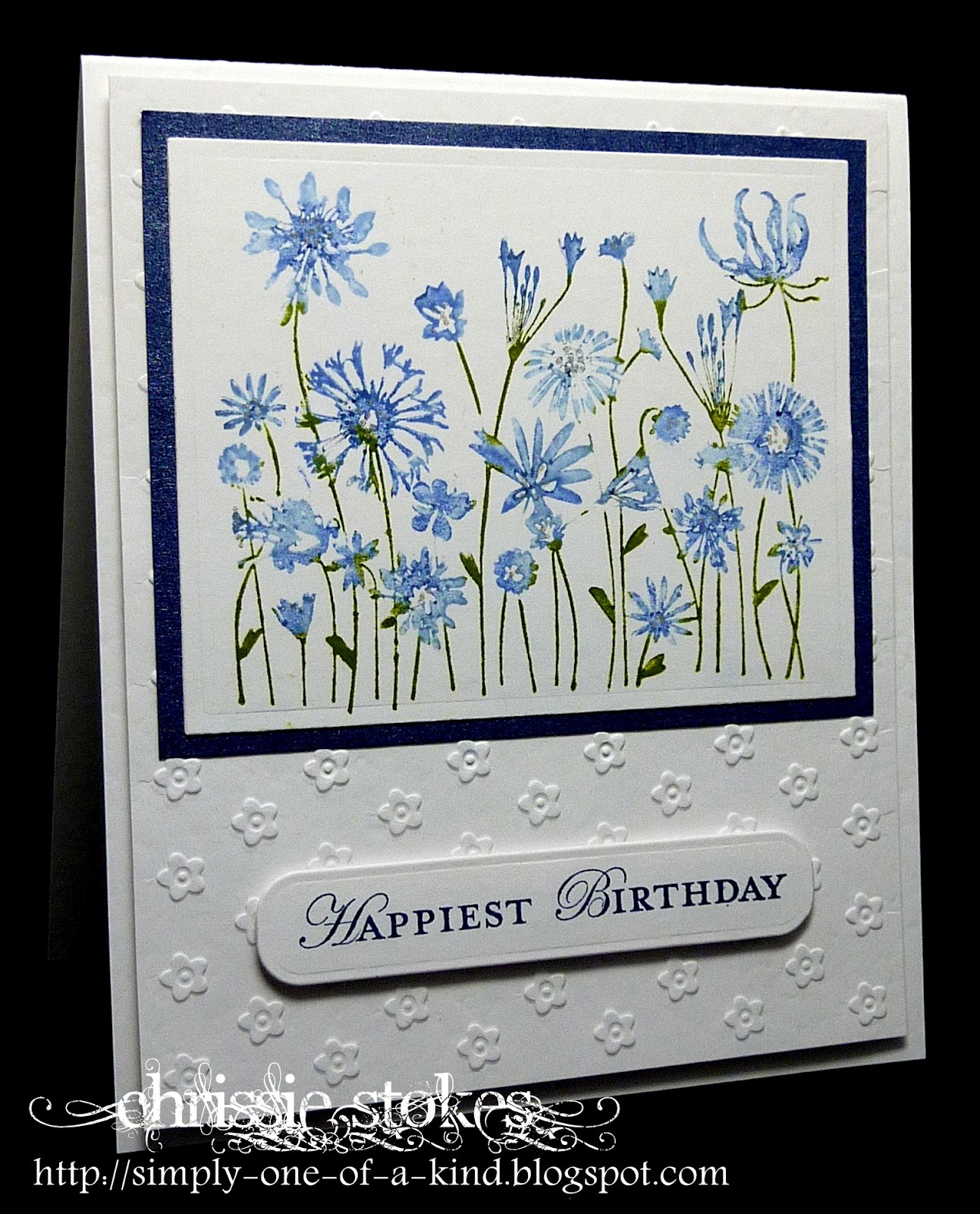
The sentiment is from Stampin' Up.
More torn 'grass' here this time with a Chocolate Baroque tree and a little additional interest added with overstamping with a text and  a splat stamp.
The embossed panel is from a Sizzix folder.
I never like to waste anything, (which is why my craft room is such a tip I guess) so here are three little panels torn from the remnants of some embossing I did for my card for our blue and green colour challenge a couple of weeks ago. I simply added a little gold around the edges of each 'square' with some embossing powder. The bird is stamped and punched with SU products and the edges of this have also been embossed in gold. The navy panel has been dry embossed with random dots from a Cuttlebug folder.


 Slimming World this week was really the best!
I lost two and a half pounds and exceeded my target by 2lbs having lost a total of 4 stones (56lbs). So I got stickers and certificates for those two achievements, then I was voted Woman of the Year by my group and also won the Slimmer of the Week award.
My aims were to be a size 14 (US 10) and look half decent in a dress. This is not a good picture sadly, I took it myself balancing my camera on the mantelpiece and it's aimed directly at my midriff, but I actually look quite good in this little dress and don't look quite as thick in the middle as appears here.
I am now a size 14 with many trousers and skirts being a size 12. A much better proposition than the size 18-20 that I was previously.
It has taken me almost a year to get here, but now I intend to stay this size! 

Saturday 11 August 2012

Time for One Layer at LIM

This time our theme for One Layer creations at "Less is More" is Fur or Feathers!
I love all the Penny Black chicken and duck stamps, which are perfect for this challenge. I think this one is the cutest!
It's simply stamped and gently coloured with Copics, with the addition of a Hero Arts sentiment.
I'm adding this to Sir Stampalot's monthly challenge, which this time around is 'Flight'! 
Here is the adorable ted from Indigo Blu. I used a mask over him to stamp the background in a slightly lighter shade of brown (Early Espresso and Soft Suede). Once more the sentiment is from Hero Arts.
Here is a touch of double stamping without re-inking to make a shadow effect, using a stamp from Unity.
The oval, made by sponging through a Spellbinder's mask, was inked with Almost Amethyst and Bashful blue with a few random splats from the SU French Foliage set added for interest.
One more chicken to conclude this week's samples... I just love them, this time the sentiment is from Personal Impressions.
I finally received my Craft Stamper magazine... it has seemed odd to see several cards submitted to the "Less is More" challenge last week using my stamp which was the freebie on the front cover this month. Thanks you for all the complimentary comments about it.
We have our grandchildren staying this weekend... should be fun.. have a good one everyone! 

Saturday 4 August 2012

CASology - Bird

Here is a little card for the reasonably new challenge called CASology. It is right up my street of course, being a challenge for Clean and Simple cards where there are some very familiar faces amongst the DT, from friends who participate in "Less is More" too!
Each challenge has the inspiration of just one word, which this time is BIRD.
It's also for the CASual Friday's challenge things you'd see in the sky
This stamp was a bargain (only £1 for a wood mounted stamp) from the last Craft Show that I attended at the NEC. I think it's Inkadinkado and the sentiment is perfect for a notelet.
I've just collected a new pair of specs today and am gradually getting used to them... they do make my eyes feel a little different from the last pair! Time will tell if I can get used to them!

Blue and green LIM Week 79


This week at "Less is More" it's time for another Colour Challenge and this time we have chosen Blue & Green.
I think it's a great combination and I made several cards playing around with the colours.
This one is a Hero Arts Stamp, which I coloured with Stampin' Up Markers. I added a few accents with a  Sakura Clear Star pen, but these don't show up too well on this picture. The sentiment is from SU mounted on an extended Spellbinders tag die. I'm not sure of the make of the embossing folder.

I love this technique for adding interest to a background stamp. I used a gorgeous, negative flourish stamp from WOW Embossing Powders, inked using Versamark, then when stamped, sprinkled with a few pinches of WOW Blueberry embossing powder, followed by a few of Green Shimmer, tapping off the excess between each application. Finally the whole of the image was covered with Clear Gold Highlight powder, then heat embossed.
I sponged a little more Versamark around the edges of the panel and then heat embossed it using Gold Sparkle powder. The hearts were stamped and the edges embossed also using the Gold Sparkle powder.
The sentiment, also from WOW, was stamped using SU Night of Navy.

This one uses a stamp from our sponsor this month, Flonz stamps from New Zealand. They are great stamps and shipping is really fast.
The colours used here are SU Lucky Limeade and a mix of blues... Bashful Blue, Pacific Point and Night of Navy. Each stamping was sprinkled with Clear Hologram embossing powder, to both set the ink and add a little depth to the colour.


For the tiny panel on this card I began by inking some card with Lucky Limeade ink using a Duster Brush. When dry, this was followed by stamping the Indigo Blu image in Versamark and clear embossing it. The blues were then dusted over the top using Pacific Point and  Night of Navy. After choosing the section I wished to die cut for the panel, I used some of the excess to die cut the butterflies with the SU Embosslits die.


Finally a very simple Simon Say Stamp/Memory Box die-cut flower with a double layer for the petals to give dimension and a Hero Art sentiment. Simples!
Have a great weekend.