Saturday, 29 October 2016

Week 300 at Less is More

Today marks the 300 week of challenges from "Less is More". This is quite a milestone for Blogland and I personally feel a great deal of pride and pleasure in what I helped create almost six years ago.
In honour of the occasion the theme this week is Celebrations and Festivals.
This simple Christmas card was made with a die sentiment from Cutplorations and  thread and bells from Memory Box.The black piece was embossed with a texture plate from  ilk but this doesn't show too well in the photograph, but just gives a little subtle relief.
Here is another Christmas celebration card; this was prompted by my purchases at the recent Sincerely Yours show in Portsmouth where I bought  the Christmas tree die from Memory Box and the sentiment from Yvonne Creations, a company new to me. For the latter I added a silver die cut and layered it with a slightly offset white one adding a few gems in salient places. The backdrop was embossed with a Sheena Douglass snowy Embossing Folder.
The last of this Christmas trio uses Sizzix dies.I sprayed the die-cuts with Crafter's Companion Spray and Sparkle in Pearl Diamond. I love the shimmery sheen it gives.The word Noel didn't actually have an umlaut over the e but I thought I'd add just a touch of red by using the berries from a holly die! The pearl 'berries' on this holly were supposed to look randomly spread, but were actually carefully placed to cover a smudge on one of the leaves!
There are some prizes up for grabs this week, so do join in and you may get a chance to win one!
The last one is just a general celebratory card... sentiment form Stamplorations and glasses from Memory Box.
Simples!
I feel really proud of the challenge at Less is More and for it to be still flourishing on its 300th week is quite an achievement!
Thanks to all who have helped make it such a success!
Cheers!

Saturday, 22 October 2016

Vellum or acetate

The challenge at Less is More this week is to use Vellum or Acetate.
Vellum is a really versatile medium and here I used it in a slightly different way from anything I have done before. 
I began by embossing a small sheet with a stencil and then dropped a variety of autumnal shades of alcohol ink and a little blending solution before allowing it to dry. I then cut some leaves from this and arranged them into a wreath shape and adding a layered die-cut sentiment from Stamplorations.
I attached them by spraying the reverse of the shapes with Spray and Stick, but I'm not too sure if they will remain secure... time will tell!
Die cut leaves are from Impression Obsession.

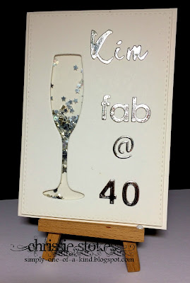
This one uses a little acetate to create the transparent part of this shaker card.
The die cuts are from Papertrey Ink and Cuttlebug.
Since photographing this I have moved the @ sign down a little... it irritated me that it wasn't quite in the right place... in fact I've also moved the Kim to the right and the 4 closer to the zero... maybe I should take another pic!
Here is another which I just made today at the request of a friend. 
It's for the daughter of a friend of hers who has just been awarded the OBE.
I began by printing an image of the medal on my laser printer and then foiling it in gold. So as to make the effect a little more subtle, I used a layer of vellum over this, to which I attached the sentiment. I used three different fonts for the die cuts and accentuated the OBE by using a larger set of dies and cutting them from gold card.
The dies used were from Memory Box (congrats and Mel) Avery Elle (celebrate) and Craft essentials Creative dies (OBE) The stars were a freebie from a magazine.

Saturday, 15 October 2016

Less is More Spiders

It's that time of year again!
I don't really 'do' the Halloween thing, but when I saw this Hero Arts set of stamps with the matching 'legs' die I just couldn't resist it, I thought this sentiment was such fun!
Here I used a Sizzix rustic brick wall embossing folder and just partially embossed the front of the card. I stamped the sentiment and die cut it with a SU die. Since I couldn't find a little spider stamp of the right proportions I merely doodled this one on the end of his thread!

At "Less is More" this week the theme is Spiders or Insects  so this is my contribution for that!

Saturday, 8 October 2016

Dreams

I don't often use LOTV images... I think I should use them more often as they are simply delightful. For this one I made the sentiment on the computer and then stamped the image in the appropriate position. When using Word, I have the size of the page set to 105%.  On my machine, that is just about the actual size of a piece of A4 card. I can then hold an image stamped on a piece of regular copy paper against the screen, letting the light shine through it, to see where I want the words placed to complement it. A bit Heath Robinson, but it works for me.

I have had this stamp from Art Impressions for quite some time, but hadn't quite figured out how to use it!
I decided to trawl the internet for a sentiment which would fit and I think that this one seems pretty good! Needless to say it was computer generated... in Brubeck AH font, I thought the style of script suited the lines of the image.
This little guy just about sums up how I feel after tearing around the country this week looking after grandkids... but I just love that fact that a) my kids want me to help out and b) that I'm still able to do it!
It's one layer week once more at Less is More so these are examples for that challenge!
The theme is Dreams!

Sunday, 2 October 2016

HLS Embossing on vellum


At the CAS department of HLS this month the challenge is to emboss on vellum.
Here I did a little dry and heat embossing.
I cut an aperture in the card front and placed a piece of vellum behind it which has been embossed using a stencil made from acetate, cut with my Silhouette  Portrait. Behind this I placed a piece of mulberry paper to add a little interest and colour.
The butterfly, from Dies for all occasions, was cut from white card (base layer) and vellum (filigree top layer). The vellum was then heat embossed using WOW St Lucia Surf embossing glitter.
The sentiment, cut from Craft Essentials Creative Dies, was similarly embossed.
It's really taking me a while to get back into the groove of card making since my amazing trip to California... I'll get there soon I'm sure!


Tutorials:

Jumbo

The cue word at CASology this time is CUTE!
There is something about elephants which is really endearing and this little one from Memory Box is a cutie!
The paper is from Pink Petticoat, the edging from MFT and the welcome die from Poppy Stamps.
I am gradually getting back into making a few cards following my extended holiday in California, I seem to have been really busy with family since my return!

Saturday, 1 October 2016

Turquoise and Lilac

It's time for another colour challenge at Less is More and this week it's the turn of turquoise and lilac!

I used these shades for Darnell's patented method of adding Brushos through a stencil, developed at the HLS retreat in Swindon earlier this year.
This stencil, from The Crafter's Workshop was purchased after I borrowed one from Kathy during that weekend, I think it's terrific. I love the tiny random circles.
The stencil was taped down over the absorbent card... (watercolour paper works best) then sprinkled with Brusho powder and spritzed with water, mopping up any excess with a paper towel. I used violet, white and turquoise. The flower die is from SSS the Love word from Wplus9 and the foliage from Memory Box... or it might be Poppy Stamps.
Apologies... the flower die is  Flower stack from Poppy Stamps!
Although this is not autumn colours it is for the Leaves challenge at Just us Girls !

To get the lilac in this one I blended some pink with blue distress inks using sponge daubers. It's a simple card made with the emboss resist method, stamping with Versamark and embossing with clear EP before adding the inks!
The sentiment was computer generated and the edge punch is from Martha Stewart.
 Additional tiny die cut butterflies are from All Occasion Dies.