Saturday, 24 December 2011

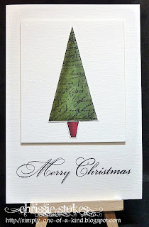
Merry Christmas

From my house to yours!
I would like to wish you all a very Merry Christmas and a Happy and Creative New Year.
Here is my Christmas tree, out for its 35th outing. I didn't think I  liked artificial trees until one day in 1976 when my husband arrived home from work in Virginia, where we were living at the time, with a very large box on the roof of the car, which contained this tree. It has graced our living rooms each year since that time and I love it. I was amazed to see that today real trees cost about £55, so apart from doing its bit for ecology, it has also saved us a lot of money over the intervening years.

The final challenge for this year from "Less is More" is the recipe of  
Just one word
and  it will run for 2 weeks.
Here are my contributions.
I've had this stamp out on my desk to use for a Christmas card for weeks, but this is the first time I've managed to use it this year. I love these Penny Black ducks, they have such great expressions on their faces.
This one was coloured with Copics and a touch of Glamour Dust was added to the letters. The edging was cut with a Spellbinders die.
You probably recognise the style of this one as I've used it many times before. Fab Artemio trees in a masked and sponged strip where I used the Natural range of inks from SU EArly Espresso, Soft Suede, Crumb Cake and Sahara Sand ... with white of course. The birds are Hobby Arts and the sentiment is part of a SU one which I masked with Selotape before inking so as to get just one word!

This is a retired SU stamp which has the word 'Hello' as part of the design. I think it's a really pretty stamp. It has been coloured with Promarkers.


This one is another SU stamp... a heart this time, mounted on a Nestie with a backdrop from Pink Petticoat... I think, but I wouldn't  like to swear to that!


We will be sharing our Christmas celebrations with our daughter and her family and are so looking forward to being with them all. Daisy is really excited! I hope that you have a Wonderful Christmas wherever you you may be!

Sunday, 18 December 2011

Pocket and Floss

Back in the summer, I saw a pair of rabbits like this on someone's blog and thought that they looked terrific. I managed to get the pattern for them and my daughter thought that they were super too. When she was staying with us we went to get the necessary fabric and notions which have been sitting in the bag since then. I thought I'd try to get them made to give to Daisy and Seb (my grandchildren) for Christmas.
Well... here they are!
Last year at my daughter's request, I made a knitted Miss Mouse for Daisy and she was somewhat underwhelmed with it... it will be interesting to see their reactions to these little guys!
I think they're cute anyway!

Saturday, 17 December 2011

Music at "Less is More"

At "Less is More" this time we have a challenge which involves using something Music related. This is right up my street as I sell most of my cards through my choir and of course members often like to have cards with this theme.
I think that music manuscript is particularly useful as a background, to add a little interest to a card and I have many stamps in varying sizes and styles. This one is from a Penny Black set. The square was cut with a Nestie Deckle rectangle adapted to make it square. (There's a tutorial for this type of thing on the LIM blog) The butterfly is made with a SU/Sizzix  embosslits die.


Here I used an Artemio background stamp for the mount, to co-ordinate with the manuscript design on the Hero Arts Christmas tree.
The sentiment is from Penny Black.


For this card I used an acrylic block stamped with Distress ink and sprinkled with Perfect Pearls before being spritzed with water.After stamping,  I masked it and overstamped with the same manuscript stamp as the previous card.
Then I added the stylised flowers using a stamp from Personal Impressions  and a sentiment from Hero Arts.
I used a Nestie rectangle to cut out the image, this time lengthening it slightly to accommodate the entire image.


Finally, a card using the Stampin' Up Notes wheel and a stamp from Magenta which has been stamped, coloured, cut out and embossed before being added to the card. The sentiment is from SU Plane and Simple.
Today I must get to the Post Office as I came home last night with my grandson's bedtime comfort bunny in my handbag... it must be returned.... and quickly!

Saturday, 10 December 2011

Less is More One Layer Card -Let it Snow

The challenge this week at Less is More is for a One Layer Card with the title 
Let it Snow!

I simply love making cards using the emboss resist technique.
I die-cut some Nestie squares from Post it Notes to make the mask and then stamped and inked into the squares.
 The stamps are Artemio and Rollagraph used with Versamark ink and embossed with Wow Sparkling snow and semi-dull embossing powders. The colour was added with sponge daubers using Bashful Blue and Night of Navy inks. The sentiment is from My Sentiments Entirely.
Here is another card which is just a variation on the same theme!
I used the same stamps and inks but simply varied the area for decoration.


More heat embossing.
 This card uses a bunch of snowflake images from Inkadinkado and Just Rite Stamps.
The sentiment is part of the MSE stamp which I used on the first card, masked with Selotape before inking which was removed before stamping.
The card looks very dark... it is in fact navy blue!

This next week is going to be really busy for me. Tonight we have a Carol Concert with my choir, followed by a party. Tomorrow we will be singing carols at a local Victorian Farm's Christmas Market and I cook lunch for all the singers afterwards.  
We'll also be singing at a Rest Home on Tuesday, and at the Farmyard Nativities on Wednesday and Thursday. On Friday I'll be driving to Bath to see my granddaughter in her pre-school  play.
Busy, busy, busy!

Wednesday, 7 December 2011

WOYWW 131

Yesterday I bought this carousel gizmo from a local craft shop. I had been thinking about one for ages but thought that they would be too large for my small working space. When I saw it I was surprised at  how compact it actually is. The other surprise was that nearly all the little drawers contained little bits and bobs... brads, gems, ribbons etc.
Also on my desk this week is a bunch of craft magazines... mainly Craft Stamper it must be said, but I have cards or projects published in all of them. The really exciting thing is that I have been invited to join the Design Team at Craft Stamper. The disappointment is that my copy for this month hasn't yet arrived, so I can't see my Cut & Create prism box or the card for this month's gallery in print.
I hope I manage to get around to a few more desks this week, but I seem to be running around my own tail at the moment.
I've woken with thick head this morning, I hope it clears soon as we have lots of singing commitments between now and Christmas.
Join in the fun snoop around the world courtesy of Julia, whose WOYWW link is on my sidebar.
Additional info!
I originally saw this on the Personal Impressions website, but they sell only to retailers. They gave me a list of stockists of their products and my local craft store ordered one in for me. It cost £29.99 and measures 30cms across the widest part of the hexagonal shape.

Saturday, 3 December 2011

Less is More colour challenge - Green


This little stamp from Dovecraft (it also says Studio G on the block, has been part of my stash for quite some time. Although rarely used, I really like it and think that maybe it will be used for a few more cards in the next few days.
This one is for our colour challenge this week at "Less is More" where the choice is GREEN!
I tend to keep coming back to the simple design of a band of something or other stretching across the card horizontally.
Yesterday I went to Bath once more to see my daughter and family. Daisy was doing a ballet class that parents were allowed to watch and so I looked after the baby whilst my daughter watched the class. She was almost in tears to see how wonderfully Daisy responded to the ballet teacher. She had expected that she might be a little like a fairy elephant, but was delighted to see that this was far from the truth.
This weekend we're staying at a hotel called Terravina in the New Forest, to attend a Black tie, Vintage Champagne Wine tasting, which was instigated by a gift from our son and his wife for our respective birthdays. They were back in the summer, but we decided to use the voucher towards this special couple of days.
I have bought a new LBD and am so glad that I have shed 21 pounds but I also bought some special tights to grab in a few more!
Here are a few more cards with green!


All a little predictable at this time of year, but it's what we need isn't it!
Have a great week and do join in our green challenge!

Saturday, 26 November 2011

A bit of bling for "Less is More"

A very 'me' card for "Less is More"... a little robin with a bit of twinkle in his beak!
We've had our grandchildren staying for a few days during our daughter's house move... they are wonderful... but very tiring, so this post s going to be very short... I have to grab moments for blogging when I can!
This is a trifle more blingy, using a fab SU set... Delicate Doilies and a bunch of embossing powder!
Sorry this is short and sweet but I need my beauty sleep...  I need to schedule this as I'll probably have my hands full with little ones in the morning!!
DO join in our challenge..we love to see your creations!

Wednesday, 23 November 2011

Clean and Simple Christmas

We have begun practising the music for our Christmas concert with my choir. The new book we are using (Carols for Choirs 5) has some cracking carols in it. I'm enjoying all that we're doing. The one alluded to in this card however,  is not amongst them, but we have sung some fun versions of it in the past.
For this card I used stamps from U mount. I masked the partridge to add the pear behind him and clear embossed the completed image after cutting it out.
The sentiment was die cut with an extended Spellbinder label die.
I didn't have any black brads so I heat embossed a couple using black embossing powder.
My daughter is moving house on Friday so we will be collecting my grandchildren and bringing them back here tomorrow and returning them to their new house on Sunday, by which time it should be reasonably organised and we will both be suitably exhausted!
Clean and Simple - FTL 167

Saturday, 19 November 2011

Silhouettes

Here is a card using the Hero Arts image which I used for the split negative project I made a couple of weeks ago. This time it's the whole thing in just one embossing ink. I've teamed it with part of the Memory Box deer die cuts to add the silhouette and included a simple sentiment from Penny Black. It was the second card I made for our Challenge at "Less is More" which this week is to make a card  with a silhouette incorporated into it.

This is in similar vein and although there is little white space on this particular one, the overall design is still CAS. The Hero Arts trees were stamped with Memento Onyx Black and twinkled with Glamour Dust! Once more I have used the superb die from Memory Box for the deer. The sentiment has been cut with the Memory Box die I did the positioning  tutorial for a short while ago.

Wednesday, 16 November 2011

WOYWW 128

Last week a few people commented on how 'tidy' my craft room was, when in fact nothing could be further from the truth. There is a considerable amount of organisation within my walls, but practically every available surface is bestrewn with detritus. I do have places for most things, but space is tight and things don't always get put in their allotted places! The left hand area of my desk is always many layers deep in bits and bobs.


This crate contains sets of clear stamps and the ones on the top were part of some deliveries which arrived yesterday. This box ix decidedly short on space too!

Do join the snoopers of the world, courtesy of Julia at the Stamping Ground. The link is on my sidebar,

Have a great week everyone.

Monday, 14 November 2011

Blog Candy at the Craft Barn

The Craft Barn is kind enough to be one of our sponsors at "Less is More" and now they are celebrating reaching 600 followers with this incredible giveaway.
To be in with a chance to win all these goodies follow the link to their blog.
Fingers crossed!

Saturday, 12 November 2011

Another one layer week for Less is More

The One Layer theme this week at "Less is More" is 
Leaves
One layer cards are now one of my favourite methods of card making, but I wish I didn't ruin so many at the last moment!
Of the bunch I made for this particular challenge, one was ruined by a splodgy sentiment (remedied by a new sentiment die cut and mounted over the original... arguably making it not a One Layer card any longer, but it's another for the 'for sale' box).
Another attempt saw me stamping a script stamp upside down, (remedied by cutting off the strip and remounting on another card base... another non-one layer) 
This is the re-make of that particular card. You can see that it's not necessary to have a leaf stamp to make a  leaf themed card. This was made by inking and stamping through a Cuttlebug die cut mask.


This Christmas card is a straightforward stamped image using a couple of green Distress inks and a red marker. The image is from Penny Black and the sentiment from Dovecrafts.


This last one was made by masking, leaving a strip which was inked and then over stamped with SU French Foliage stamps, using River Rock and Pear Pizzazz inks, with a little gold on the top.
I actually intended having the coloured strip in a vertical orientation, but the stamping looked much more at home arranged horizontally.
It's funny how things evolve as one goes along!

Mandi is back after a wonderful cruise... it seemed like she was away for ages! It's so good to have her back!

DO join in our challenge this time we'd love to see your creations.


PS
These are the two rescued cards, I thought you may like to see how they ended up!

Wednesday, 9 November 2011

WOYWW 127

Good morning!
This is the view to the left of my lovely comfy office chair... lots of things within handy reach. I had to do a bit of reorganising following my trip to the NEC, as there wasn't room on the shelves to accommodate all the goodies. You can see what I bought in the previous post. My Nesties are now located two shelves below my Grand Calibur, happily residing in CD cases.
For those people who commented last week saying that my little robin was worthy of finding his way onto a card... here he is. I may try to draw some more of these, I think he's kinda cute.
I have orders for a couple of dozen cards so I'd better get on with it... they don't make themselves!
DO visit Julia to see who else is displaying their wares this week. The link is on my sidebar.
Have a great day!
PS My weight loss has slowed up somewhat... 14.5lbs have now gone! My husband is winning by miles... he has lost 33lbs (2 stones 5lbs) in 9 weeks!!!

Saturday, 5 November 2011

Less is More Colour Challenge

I really enjoyed my trip to the NEC with Anne on Thursday. This is what found its way home with me, plus a 'No More Shims', which for some reason didn't make it into the picture.


We had a great day and there were some real bargains to be had... I got three packs of the Spellbinders here for only £10 per pack!  There's plenty here to keep me busy now!
Here we are, obligingly taken by a very kind crafter who just happened to be standing next to us!


On to this week's challenge at Less is More which this time is Red and Orange!
I did a bunch of cards as Mandi is away on her cruise. I really hope she's having a fab time... she's missing nothing here with all the dreadful rain we've been having.
I made this and it sold straight away at my choir on Tuesday, bought by a chap for his wife,  who incidentally happens to be a card maker. I hope she likes it!


This is one of Arielle's images from the Wax Fruit company, I simply love these tulips.They're coloured with Copics.


Here is another of Arielle's images, isn't this simply stunning. It's actually just the quarter gerbera, but I duplicated it and swished it round to make the full flower, once more it's coloured with Copics.

Lastly a die cut one, using my SU Embosslits butterflies.

All the cards are red and orange, all clean and simple, all with white space.
DO join us and have a go at our Clean and Simple challenge... you might even find it fun!!

Wednesday, 2 November 2011

WOYWW

Does anyone else do this?
Make embellishments or elements to go on cards and then either lose the impetus to carry the project through or become dissatisfied en route.
This little heap is the evidence of my unfinished business. It's a case of 'I thought I would use it for something' kind of thing.
Actually I quite like the little robin... I drew him last night and I think he may find his way onto a Christmas card... as to the rest, well it's anyone's guess as to how long it will stay in this pile.
Join the worldwide snoop that is WOYWW. The link to Julia is on my sidebar!

I shall be going to the NEC tomorrow, Thursday... if anyone else is going do say Hi!

Tuesday, 1 November 2011

Cuttlebug Embossing Tip... NO Lines!

Have you ever tried to emboss a small folder in the Cuttlebug, only to find that the pressure of the plates on the edges of the folder leaves embossed lines on the card?
Well here's a little trick I discovered which avoids that.
Instead of using the sandwich of base A plate, embossing folder plus card and 2 B plates, I use
  •  the base A  plate,
  •  then the folder with the card inside,
  •  a tan embossing mat 
  •  C plate.
You get a really crisp emboss and NO LINES!
Another cunning plan!

Monday, 31 October 2011

Memory Box Tag Die Cutting Tutorial

I recently purchased some tag dies from Memory Box. I was a little nonplussed by the fact that these are solid dies and therefore you can't see exactly where you are placing them once you have stamped the sentiment.... Soooooooo I set about trying to think of a way around the problem and this is what I have come up with!
I cut 2 guides from card stock one for the large tag and one for the small one and cut off part of each leaving
one complete, small template and one complete, large one.
For this sentiment I wanted to use the larger of the two dies, so I positioned that guide around the word.

I then placed the die into the template/guide and taped down the end not being used with some low-tack tape...this is actually a tiny Post it note.
I then carefully removed the guide and ran the card with the die attached, through my Cuttlebug.

The result, a perfectly positioned sentiment, with all the guesswork removed from the equation.
What do you think?

Sunday, 30 October 2011

New Beginnings

This morning my daughter rang to say that her friend from her university days and Godmother to her son, had given birth to a baby girl. She asked me if I could make a card for her. The new arrival is to be called Cora Belle.
This is a side stepper card with the tall side made to resemble a chest of drawers. The images are digis by Beccy, the paper is Pink Petticoat and the die cut letters are from Cuttlebug's Babyface Alphabet...as is the little flower.
From the front I think it looks a little more like a chest of drawers. The name, the dress and shoes and the flower are gently twinkled with Glamour Dust...well every girl needs a little fairy dust doesn't she!
CES Challenges - New Beginnings
Our Creative Corner - Fancy Folds