Monday, 31 October 2011

Memory Box Tag Die Cutting Tutorial

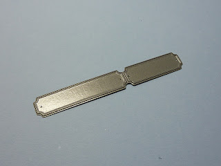
I recently purchased some tag dies from Memory Box. I was a little nonplussed by the fact that these are solid dies and therefore you can't see exactly where you are placing them once you have stamped the sentiment.... Soooooooo I set about trying to think of a way around the problem and this is what I have come up with!
I cut 2 guides from card stock one for the large tag and one for the small one and cut off part of each leaving
one complete, small template and one complete, large one.
For this sentiment I wanted to use the larger of the two dies, so I positioned that guide around the word.

I then placed the die into the template/guide and taped down the end not being used with some low-tack tape...this is actually a tiny Post it note.
I then carefully removed the guide and ran the card with the die attached, through my Cuttlebug.

The result, a perfectly positioned sentiment, with all the guesswork removed from the equation.
What do you think?

Sunday, 30 October 2011

New Beginnings

This morning my daughter rang to say that her friend from her university days and Godmother to her son, had given birth to a baby girl. She asked me if I could make a card for her. The new arrival is to be called Cora Belle.
This is a side stepper card with the tall side made to resemble a chest of drawers. The images are digis by Beccy, the paper is Pink Petticoat and the die cut letters are from Cuttlebug's Babyface Alphabet...as is the little flower.
From the front I think it looks a little more like a chest of drawers. The name, the dress and shoes and the flower are gently twinkled with Glamour Dust...well every girl needs a little fairy dust doesn't she!
CES Challenges - New Beginnings
Our Creative Corner - Fancy Folds

More Clean and Simple Cards

I'm always looking for embossing folders which can be extended widthways. This Sizzix one is perfect as it has vertical demarcation lines, so the section to the right of the clock is where the repeat begins. It works perfectly, covering the the whole width of this card... and that pleases me!
The image is from Stampin' Up, coloured with Copics, punched with a Stampin' Up punch which is in turn mounted on a Nestie label.
The sentiment is computer generated in High Tide font from Two Peas in a Bucket.
Casual Fridays - Sketch
Alphabet Challenge - Food or drink
The sketch (164) at Clean and Simple this week is very similar in vein to the previous card. Here I used a piece of DP from Paper Cellar Ltd as the focal image, cut and mounted with Nesties.
The heart is from Marianne's dies embellished with a few adhesive pearls.
I bought the tag die from Memory Box recently and although I'm pleased with the shape, I was rather disappointed to see that it is a solid plate, making it impossible to position it accurately over a stamped sentiment. It also flattens the card somewhat, unlike Spellbinders which allow the card to protrude into the open central part of the die. I stamped this sentiment after I had cut the tag.

Saturday, 29 October 2011

Week 39 Lucky Dip Stars

We have our wonderful LIMette, Vicky, joining us this week as Star Guest Designer at "Less is More" and for this special challenge we chose the theme of STARS.
This one was made with one of my fave techniques... emboss resist, using a star stamp from an Artemio Christmas set, together with some splodges from SU's French Foliage set. The starry border is from a Martha Stewart punch and is trimmed with a double ribbon supporting a tiny star charm.
The sentiment is from Hero Arts.
This one is made using the Split Negative technique, where two images were embossed, one in black on white and the other in white in black, both using twinkly embossing powders. Both images were then cut in half vertically and each section joined with its negative.
Of course you get two cards from the process which is a bonus!
The stamp is called Starry Night from Hero Arts.

A fun one to finish... this is one of a dozen or so asked for by a friend who has moved back to Massachusetts and asked specifically for rectangular cards because of the US postal rates. Her husband will be popping by to pick them up before he finally moves back there. It's another using my new Hero Arts/Sizzix combo of stamps and dies.
The sentiment is computer generated using Elementary SF and Enviro fonts.
Christmas is definitely coming!
I shall be visiting the craft fair at the NEC on Thursday, travelling with Anne (Stargroves) and we are looking forward to a great day. Do stop and say Hi if you see us... I'll be carrying my "Less is More" tote!
Have a great week.
Bah Humbug - Die Cuts
Charisma Cardz - Anything Goes

Thursday, 27 October 2011

Chap's Christmas card

A couple of new sets of stamps arrived the other day, this tree being from one of them. It's a Hero Arts Christmas tree with a music manuscript design. I'm a real sucker for anything music related.
I stamped the Artemio background and chopped it into 3 pieces, for three different cards and stamped 3 trees, which I coloured with Copics. I cut them out, scored them vertically and stuck them together to give a 3D effect.


A little Glamour Dust was added... I really rather like a bit of twinkle. I inverted the pot as I rather like how the shape echoes the tree this way up.

The sentiment is from Papermania I think.
This is a page from December's Papercraft Inspirations Magazine. As you may be able to see there is one of my cards there!
Getting published seems to be getting to be a bit of a habit! Lucky me!

My Time to Craft - Quite White
Bah Humbug - With Men in Mind

Wednesday, 26 October 2011

Still playing with new toys!

This is another image/die from the Hero Arts / Sizzix combo, which I recently purchased. This has been inked in the same way as the apples in my last post, using the same Shabby Shutters and Forest Moss Distress inks.This is just a simple tree with no design or texture on it so would is perfect for treatment such as the kissing technique... I must try that next.
The sentiment is from SU's Basic Phrases. I cut pieces of acetate from crafty packaging into rectangles, and stamped them with each of the stamps. I keep these in the box with the stamps to use with my Lego positioner. Each stamp is a separate word which obviously needs to be aligned with another, to make each sentiment. It saves me having to stamp a piece of acetate each time I use the stamps.
I used the sketch from Clean and Simple!

Tuesday, 25 October 2011

Apples, Apples, Apples

I love messing around with ink.
This stamp has no texture and so is perfect for adding different shades of ink to give the appearance of dimension. Sadly, I make a proper mess of the wood of the stamp in the process, but that doesn't worry me particularly, as long as they are cleaned, I don't worry of they are slightly stained.
Here I used distress inks, applied directly from the pad, beginning with Shabby Shutters, then adding some Forest Moss around the edges, with a touch of Fired Brick, applied with a fairly stiff brush to add a little blush across a couple of the apples. A quick spritz of water and then it was stamped.
In reality the base card is a closer match to the inks than it appears here.
The stamps are from A Stamp in the Hand.
The weight loss is now up to 13lbs Whoo Hoo!
Little Red Wagon - Fall
Sir Stampalot's Monthly Challenge - Food Glorious Food -

Monday, 24 October 2011

New Stash

I'd seen these sets of stamps and dies on various websites and I finally decided that I had to try one. This is the Hero Arts/Sizzix combo of Christmas stamps and dies and my package just arrived.
I think this little chap is a real cutie, Here he is again (or his brother) doing a little gymnastics.
Both cards use embossing and pop dots to add a little dimension. The top one also has Glamour Dust added to his sweater although it doesn't show up terribly well. The trouble is that once you start adding dimension to cards the postal costs start to rise.
If it weren't so heavily layered this last one would have done for our Polka Dot challenge this week at "Less is More". Have you entered a card yet?
The embossing folders used were from Cuttlebug and the colouring was with Copics.
My friend came with me this morning to try to choose some new frames at the opticians, I fancy having a spare pair of specs... choosing this time seems particularly difficult! Maybe I'll find some soon!
ABC Christmas  Challenge - U - Unused stash!4
My Time to Craft - Punches and Dies
CASual Friday - Add colour (Copics)
Charisma Cardz - Embossing
One Stop Crafts - NO Designer Paper
One Stitch at a Time - Emboss it

Saturday, 22 October 2011

Polka Dots - Less is More

Call me a simple gal, but I love spots and stripes... I like gingham too come to that, and this week the challenge  at  Less is More is Polka Dots.
Here I have used a Waltzing Mouse clear stamp in Adirondack Oregano ink. I trimmed the long edges of the panel with my Woodware cutter, using the scallop blade. I then cut top to tail triangles to make the layers of the Christmas trees.
I love the ink effect on this hammered card, I think the uneven coverage adds a little interest which I prefer, rather than just using a polka dot backing paper.
The trunks were stamped with a Stampin' Up sentiment stamp, it actually says WITH JOY but that was too long so I opted just to have the JOY part showing. The sentiment is from SU's Contempo Christmas.
My vertigo still keeps recurring and I keep trying the Epley manoeuvre from time to time...maybe it will settle down again soon... what it is to be getting old!
Do join in with us this week, it's a simple recipe for a Clean and Simple challenge.

Thursday, 20 October 2011

White Wedding

I love white on white and this card is my latest  made solely with diecuts. I love the flowers which are Dienamics, the hearts are Nellies and the leaves from  a Marianne die.
The computer generated sentiment is the first that I have tried heat embossing and I'm really pleased with the result. Next time however, I shall take Mandi's advice and use the best print quality, which may lay a little more ink on the card. It's pearlised card, which allows the ink to stay wet enough to accept the embossing powder, although I think you still need to be fairly quick.
I also made a box for this as the flowers don't have a hope of fitting in an envelope!
My Time to Craft - Dies or Punches
Top Tip Tuesday - Layer it up

Wednesday, 19 October 2011

WOYWW 124

Goodness, how quickly the weeks pass!
Another Wednesday and another WOYWW! For those new to the phenomenon it means an opportunity to snoop around the workdesks of the world, through the brainchild of Julia... the link is on my sidebar.
Do join in!
Yesterday I received a package containing my SU In Stitches Jumbo Wheel, which I promptly popped into the microwave for a few seconds in order to soften the adhesive so that I could get the stamp off the wheel. I didn't really want all the rows of stitches all together, so once I had removed the rubber from the wheel I popped it onto some EZ Mount and cut the individual rows of 'stitching' into separate stamps, which I think will be much more useful. I'm going to store them in with another SU set...  Plane & Simple... I hope I can remember where they are when I need them.
I shall have to come up with a use for the empty wheel now!
My husband and I decided to go on a diet as he needed to lose weight because of high blood pressure and I needed to because I was fat!
In the six weeks that we have been going to Slimming World, my husband has lost over a stone and a half and I have lost 12lbs. Slow but sure... that's me!

Tuesday, 18 October 2011

Thanks

This last weekend we went to stay with my brother and his wife who live just outside Stafford. My mother and grandmother had lived in a granny annex adjoining their property until they passed away 9 and 36 years ago respectively. I finally managed to get my brother to organise the interment of their ashes and the service took place on Sunday morning. They now rest together under a spreading chestnut tree, which was planted some years ago  in the church grounds, by my brother. It was a lovely service and good to catch up with my two brothers whom we see too infrequently.
This card is to thank my brother and sister-in-law for their hospitality for the weekend and for organising the occasion so fittingly (if extremely tardily).
Clean and Simple - Sketch FTL 162
CR84FN - Kraft, Red & Brown

Saturday, 15 October 2011

Less is More Week 37 Cocktails

I don't know how we come up with these ideas... they seem so good at the time, then when push comes to shove we find it difficult to come up with something scintillating!
This week  the challenge at "Less is More"  is Cocktails!
Anyway here's my five penn'orth!
This one is a stamp by Art Impressions heat embossed, lightly coloured and Glossy Accented. The sentiment is from SU's Wonderful words.

This bit of nonsense used Penny Black's Chicky Night stamp given to me by my lovely friend Mandi, I just love chickens! I'm not quite sure sure which is me!!!
This last one is the singular Cock-tail!
Say no more!
The images are from Stampin' Up's (now retired) Rustic Rooster set. I do hope you will test your imagination and give this challenge a go!
Have a great weekend.

Wednesday, 12 October 2011

WOYWW 123

Oh Dear!
All those people who looked at my room last week and thought that I was tidy and organised... how wrong can  anyone be. Today anywhere is my room is a mess... the bed is strewn with anything and everything, the floor is also liberally decorated... there's still room for me on my chair though!
On my desk is a new large acrylic block with a handle for the stamping of huge stamps which will cover a whole card. It arrived yesterday. I think there's a bit of a technique to using these, a) in getting the amount of ink correct and b) the pressure over the paper, but I'm sure I'll get there.
I'm wondering about getting one of those hexagonal, swivelly desk caddies, but I think that the size might just swamp my tiny work surface.
My husband and I have embarked on a slimming regime... I've lost 9 and a half pounds but my husband has lost almost 2 stones in 5 weeks! He's been Slimmer of the week twice and was Slimmer of the month for September. He's got more stickers than I've had hot dinners! At least my weight is moving in the right direction!
Have a great Wednesday and do join Julia and the snoopers of the world. The link is on my sidebar.

Sunday, 9 October 2011

SU Only Leaves

I came across a challenge blog today... as you do when hopping from creation to creation... which is for Stampin' Up products only and their theme this week is leaves. Well this was right up my street as I love leaf images and I love Stampin' Up, so here is a CAS card using the  French Foliage set, which I have to admit is one of my all time favourite stamp sets.
The squares were cut with Nesties and mounted on a rectangle the exact width of the card which was hand embossed both above and below the panel. The card was similarly treated either side of the ribbon.
I'm just about to cut my husband's hair... we must have saved so much cash over the years by my ministrations in this department... all the more for my stash fund!
SU Only Challenges - Leaves

Saturday, 8 October 2011

Black Magic

The technique for colouring on a black background is apparently called Black Magic and is the challenge at Just Us Girls this week.
The process involves stamping a fairly solid image in white ink, drying it and then colouring with Watercolour pencils. I used several makes of pencils as I wanted to have varieties of the same colour families on each flower. I did blend the colour with a water brush as water brings this medium to life. I used a twinkly pen for the flower centres but I'm not too sure if this shows up on these pics.
The flowers are from a set by Hero Arts and work perfectly for this technique. They have been die cut with Nesties and mounted on an embossed base trimmed with a Martha Stewart edging. The sentiment is also Hero Arts.
I bought a new set of phones today as our old ones were causing all sorts of probs... one even cut off Mandi and I in mid sentence the other day and that will never do. All I have to do now is work out how to use them and set them up properly. It may be easier said than done.

Less is More One Layer Hearts!

When I came to think about what I was going to do for this challenge, I realised that although I have heaps of heart stamps I usually never make them into ONE LAYER CARDS... it set me thinking! Those girls at Less Is More certainly know how to pose a challenge!
Using kraft card is also something that I have never really previously embarked upon. The other day Mandi gave me quite a few samples of kraft card and this is one of them. This is SU's crumb cake and I think I like it best of all the ones she gave me.
I masked with Post It notes leaving a section which I then coloured with SU Whisper White ink applied with a sponge dauber. I stamped with the SU stamp, the set from which it comes has escaped me and coloured it with Copics. These pens had a really odd effect on top of the ink, so in order to jazz it up a little I added some Glossy accents. The sentiment is one I've had for ages, never used and forgot I had, until it turned up in a rummage today.


This one is a simple ONE LAYER sort of... there's actually a hole in the front of the card and the panel is sitting on a piece of acetate inside the card.


You may be able to see this more clearly here!
The heart is from SU the flower from Inkylicious and the sentiment from Studio G


This last one is just a bit of fun with a digi image from Bugaboo!

I printed both the image and the computer generated sentiment directly onto the card and coloured it with Copics.

The font is Viner Hand ITC.

Have a great weekend and don't forget to join in the fun at "Less is More".

Thursday, 6 October 2011

My new tag die

It seems ages since I covered the whole of the front of a card with paper. I tried a bit of an experiment here, by stamping a strip of teal coloured card with Versamark and then clear embossing it, followed by rubbing over the embossed image with metallic rub on paste. I stamped the background piece with the same SU Bella Toile background stamp, this time using Weathered Wood Distress ink. I thought that this was a similar shade to the metallic paste, so giving a positive and negative effect.
I also rubbed the Spellbinder's fancy tag to give it a metallic sheen, but this doesn't show too clearly in this picture.
The sentiment is also from SU and cut with another Spellbinder's tag which I lengthened in order to accommodate the whole sentiment.
A little inking of the edges and a few pearls at the top and I was done!
Off to have my hair chopped this morning, it's much too long at the front so that will be a great relief... I have restrained myself from taking the scissors to it myself, for which I'm sure that the hairdresser will be eternally grateful!
Anything Goes - Use die cuts or punches.

Wednesday, 5 October 2011

WOYWW

I haven't managed to join in the fun of having a good old snoop around the workdesks of the world for quite some time, but having had lunch with Julia  and Jan yesterday... I kinda felt guilty that I hadn't visited for a while... so here I am.
I haven't been incredibly productive this week, but have been fiddling around with various techniques to see what worked and what I liked. The sharp-eyed amongst you may spot another bird from my leaf stamp, I added a tail from a SU flourish stamp and drew some legs and a neck...this particular image is not good enough to put on a card, because of the ink splats and poor penmanship, but it was fun... it's an ostrich...what do you think?
The Sansador is still there from a session cleaning the sticky goo from cutting E Z Mount, off my (non-stick) scissors. (It works brilliantly if you've never tried it!)


This picture shows the bookcase that I heaved into my craft room from one of the other bedrooms, it's really handy to have so many things within grabbing distance. In fact most things are within gabbing distance as my crafting space is so small!


This is a snippet from November's edition of Craft Stamper magazine. I was asked if I could do an article for the Designer's Palette section in this edition. Needless to say I was happy to oblige. This is the third consecutive month that I have had at least one of my cards published... in this edition there are three.
I'm not permitted to show you the whole page, or show one of my pictures of my cards, but you can just  see a little of one here and the rest can be seen in the mag.
I also have a card on page 42!
Well, I'll be off to have a wander around the workdesks of the world just now...have a happy Wednesday!
The link to Julia is on my sidebar.

Saturday, 1 October 2011

Less is More Colour Challenge and another bird

Here is Bird number 4... this time he's a bluebird, to match my eyes!
The challenge at "Less is More" this week is another colour challenge and  we have chosen 
'The colour of your eyes'!

In fact my eyes are rather greyish blue, but I have taken a little artistic licence with my colour palette!
Here's another bluey grey-ey card this time using Distress inks to swipe the base layer with a Paper Artsy stamp for the flowers.
More details are on the "Less is More" blog.
Have a great weekend!

ABC - Anything goes