Saturday, 28 January 2012

Less is More - Sketch 4

This week at "Less is More" our challenge is a sketch. My first card is basically a one layer card... details are on the LIM blog.
As our challenge is dedicated to all things Clean and Simple... we have a very simple sketch.
I have made three cards for this week's challenge, these first two began with a masked and inked strip which has been further adorned with stamping. This one also uses a Glitz it Now background (text) stamp over the band and Inkylicious flourishes with a Papermania birdcage. 
The chain on the birdcage is quite short and as I don't like to see disembodied objects on cards, with a little masking, I managed to stamp some extensions to the chain to make it reach the edge of the card. 
The sentiment is from Personal Impressions.
The last one uses the Black Magic technique, details of how to do this are on the "Less is More" blog.
I've just had a couple of days looking after my grandchildren... thinking about my state of tiredness now, it makes you realise why nature intends you to have children when you're young!
Have a lovely weekend, I'll be off helping to look after my brother-in-law who has just a had a second hip replacement operation.

Wednesday, 25 January 2012

Be my Valentine

I need to make a few Valentines to sell at my choir. This one is a simple heart from SU stamped in Versamark and clear embossed.  Once cut with a  Nestie square, I inked it with Distress Ink in Festive Berries and then stamped it with a Tim Holtz paisley stamp using Aged Mahogany. Finally I gently buffed the heart with a paper towel to remove any surplus dark ink and make the image pop.
To tie in with the paisley stamp design, I used a paisley embossing folder for the horizontal panel.
A length of gingham ribbon and a Valentine sentiment completed the card.
I add ribbons by dabbing a little adhesive on the back of the panel and attaching one flat piece of ribbon across the front, fixing only at the back. I then cut another small piece of ribbon which I slip behind the first piece and fasten with a single knot.It can then be slid to any position along the length of the ribbon and the knot remains reasonably flat ( thinking about postage costs!).
My Time to Craft - Favourite Embellishment (ribbon)
Anything Goes -To the one I love!
Creative Card Crew - Seeing Red
Just Us Girls - Red White, Pink
The Craft Room Challenge - Valentines

Monday, 23 January 2012

Casual Friday Black & White

I've just spent half the morning it seems, looking for my camera charger. Things have come to light in the process which I hadn't realised were missing, but it's good to know that they are in their rightful places once more. Eventually, when on the phone to my daughter to ask if perchance I had left the charger at her house, I spied a tell tale bit of cable under the unit which houses my guillotine! Eureka! One camera charger!
I don't seem to have had so much time for challenges in latter months... maybe something to do with the amount of commenting I do for "Less is More", but I fancied a go at the Casual Friday challenge of a clean and simple, black and white card.
I'm not really sure of all the components of this one... Martha Stewart flower border punch, Spellbinder Pennant die for the Kaisercraft sentiment. I think the butterfly is from a Marianne Creatable die, gently glittered with Glamour Dust although it's hard to see it in this picture. I'm not certain about the embossing folder.. it's a large one(5x7), with no identifying feature on it, but I think it looks great.
I'm afraid I haven't managed to capture the detail on the white parts of the card, but this was the best I could do before my camera battery died.
I shall be looking after my grandchildren for a couple of days from Wednesday, so I'd like to get a little crafting done before that... there will be no chance whilst I have those two munchkins to care for!!
Sir Stampalot - Monochromatic

Saturday, 21 January 2012

Theme Week at Less is More - Apertures


A very simple card with a single rectangular aperture, cut with a Nestie and part of a Martha Stewart Butterfly border punch, gently twinkled with Glamour Dust which has been inserted into the gap.
The sentiment is part of a stamp from Stampin' Up retired set, which I masked before inking so as to get just the one word.
This one simply had a slice cut out of the front of the card, which was then filled with Sizzix Bigz die-cut hearts. These had been embossed with a Crafts Too Embossing Folder. The sentiment is from the same SU set as the first card.


This is close up of one of my cards on the "Less is More" blog. The aperture has been cut with a Nestie, avoiding the image which protrudes into the circle.

A short tutorial for this is on the LIM blog.


This white on white card would be suitable for a wedding or engagement... in fact it was bought for the latter purpose as soon as I had made it earlier in the week.


A quickie to finish.. a Nestie square cut-out, overlaid with a Sizzix Heart embossed with a Cuttlebug Embossing folder!
I was asked at my choir on Tuesday for Valentine cards, so I thought I'd better get a head start on them. I think that some of these will do!
Do join us for another Clean and Simple Challenge over at "Less is More". It will soon will be our first birthday, what a wonderful year we've had too... we can now boast 1200 followers!
WOW!

Saturday, 14 January 2012

Week 50 Less is More - One Layer - Birds

It's One Layer Week once more at "Less is More" and time to get back to the basics of Clean and Simple cardmaking. The subject this time is BIRDS!
It seems that as each week goes by, more layers seem to find their way onto many submissions and white space all but disappears, so to have a One Layer challenge once per month does tend to drag things back into perspective.
Here is a cute image from Penny Black of a couple of  darling ducks. Stamped and masked, with the circle inked using Ink Duster brushes, it's a really simple composition. The sentiment is from Stampin' Up.
Here's a cute chicken from Artemio with the sentiment from Hero Arts.
Simply coloured with Copics, it doesn't really need much explanation.!


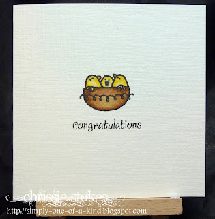
This is a tiny card using another image from the same Artemio set.
The sentiment if from Wild Rose Studio.
It could be for a new Home or a new Baby.

We went to Bath yesterday to see my daughter and our grandchildren. My son is with us for a few days, whilst his wife is busy working and so he came to see his nephew and niece for the first time for many months. It's such a shame that the siblings live so far from each other.


This final card for this week means that you'll have to look closely for the birds, but they're there!
The lighthouse, birds and dune grass are from Hobby Art sets and the sentiment is from Inkylicious!
The colours used for the inked background are SU Bashful Blue, and Barely Banana, with a little Mellow Moss for the grass. I painted the lighthouse itself with a little white watercolour.

Now I need to go and make a 60th birthday card for a a friend whose tea party we'll be attending this afternoon. Let's hope inspiration strikes before I reach my desk!

Have a great weekend.

Tuesday, 10 January 2012

Clean and Simple Craft Room

I saw a card the other day, which I just loved. However, I now can't remember where I saw it or whose blog it was on... but I'm sure I'll be able to find it sometime soon.
I have just found it.... it's from Laurie's blog here.
It gave me the inspiration for this one. This almost looks as though it has been masked, but is in fact simply a flourish from Stampin' Up's Joie set, which has been stamped onto red paper and embossed with WOW Sparkling Snow EP. A section was then punched using the Stampin' Up heart punch.
The manuscript stamp is from Hero Arts, stamped in Stazon, with the heart simply stuck over the top. The paper and card are a pretty good colour match however.
Easy Peasy!
Craft Room Challenge - Clean and Simple

Saturday, 7 January 2012

Happy New Year and back to LIM

For our first challenge of 2012 at Less is More we are once more in the first Saturday of the month which means a colour challenge. 
We chose Predominantly Purple!
This is a challenge for us too as neither of us is terribly at home with purple, although I can think of a few LIMettes who will LOVE it!
The details of how this was made is on the LIM blog. I haven't been very creative throughout the holiday period and am finding it rather difficult to get back into the swing of things. The fact that I haven't been well for the past week hasn't helped greatly. I should be singing solo tonight at an annual Come and Sing with my choir... Vivaldi's Gloria and Parry's Blest Pair of Sirens, but as I have this pesky cough I don't think I could sing more than a couple of bars before disintegrating into a coughing fit!

My second card was a commission for a friend... how fortunate she asked for purple!

Here are a few examples of purple themed cards from my supply.


I really hope you'll  join in, even if like me, you find purple a challenge!

Latest news on the weight loss regime in our house is that we both managed to lose weight over the holiday. My husband has now lost 4 stones (56 pounds) and I have lost just over 2 stones (29.5 pounds, to be precise). We are mighty pleased with ourselves, but my husband now has very few clothes which fit him. Santa was kind, but didn't want to get too much as he thought even they might not fit him for too long!
For those interested.. we are losing weight with the Slimming World programme!!