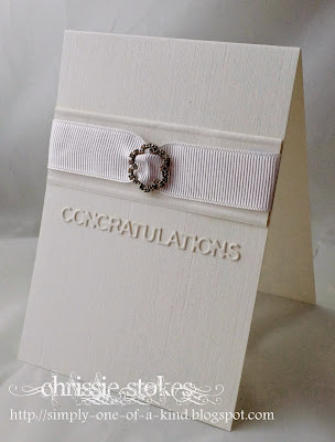
The recipe at "Less is More" this week is to include some metal on your card!
There seems to be lots which could be added, but I have gone with a buckle for one card and a charm for the other!
I really love the simplicity of this one.. almost to the point of thinking that I haven't done much to make it... but the main feature of CAS is knowing when enough is enough... and I think that this has enough! The die is from Tattered Lace!
This is also for the challenge at CASology

This is also for the challenge at CASology

This card is another simple one with a Memory Box Golf Landscape die coloured with alcohol markers, mounted on a scored panel, with a Fiskars punched edge. The metal charm is suspended on some baker's twine and the sentiment and its tag are from Stampin' Up!


Love these, Chrissie. Your first card is just beautiful. Sometimes CAS can take a lot of work and other times it just happens, it needs nothing more xx
ReplyDeletePerfect and CAS-tastic! Love the elegance of the first one and the superb charm and scene on the second. Simply brilliant. Sarah x
ReplyDeleteYour first card is really classy and would make a great wedding invitation :)
ReplyDelete2 lovely cards love the WOW xx Jan
ReplyDeleteBoth lovely cards Chrissy but the one with the buckle is awesome.
ReplyDeleteReally love that one. It is as you say you have to know when it's enough. That's the difficulty for me. Still haven't figured that out completely. Thanks for the inspiration.
Hugs Veerle x
love the white card it's super CAS and elegant
ReplyDeletelove the white card it's super CAS and elegant
ReplyDeleteGreat cards, Chrissie - the little metallic elements bring an elegant finish to the designs! Love your first card - just beautiful and the golf charm on the second is such a fun touch :) Thanks for the tip on extending the die cut frame - I shall check it out!
ReplyDeleteWOW, your first card is so stylish and elegant, Chrissie!!! That buckle is so beautiful and I love the sentiment die!!! It really doesn't need anything more - it's CAS at it's best!!!!
ReplyDeleteLove the cute little scene you've got on your second card!!! The bright green and red are so lovely against all the white!!!! Love the cute charm, the twine and the lovely scalloped strip!!!
Both cards are lovely, Chrissie!!!
Have a great weekend!!!
Both great cards! Love the perfect stylish and super CAS first card! On your second the charm is so perfect with the golfcourse you made! Enjoy the long weekend!
ReplyDeleteTwo super cards...so classy and elegant and such a cute charm you have added to the second one.
ReplyDeleteYour wedding card is perfection - the winner.
ReplyDeleteThe wedding card is so elegant - absolutely perfect; and the golf range scene makes me wish I could try that course! Love all of your pieces, always.
ReplyDeleteThe band around the card is so elegant. Thank you for sharing with us at CASology!
ReplyDeleteThat wedding card is definitely a winner. Love it!
ReplyDeleteThey are both wonderful, and I really truly love your CAS wedding card. You definitely knew when to say when. Thanks so much for playing along at CASology this week.
ReplyDeleteYour wedding card is so elegant Chrissie, I love the white sentiment, Cathy x
ReplyDeleteYour wedding card is so elegant Chrissie, I love the white sentiment, Cathy x
ReplyDeleteYour white card is simply lovely. Sometimes I feel cheated if a card is too simple and I haven't done much, others make up for that!
ReplyDeleteFirst card is a pure elegance. I like it very much. Also the second one is amazing. Great idea!
ReplyDeleteTwo great cards, the wedding card is so classy and the golfing card is kind of fun. Karen x
ReplyDeleteTwo fabulously CAS cards Chrissie!! xx
ReplyDeleteLovely so elegant!!!! So glad you joined us at CASology!!!
ReplyDeleteGorgeous cards Chrissie ..... love the wedding one, so elegant! xx
ReplyDeleteSimple maybe, but that first card really is so classically elegant Chrissie - gorgeous!
ReplyDelete