Pages

Monday, 29 October 2012

About time for a challenge

It seems that I haven't designed a card specifically for some of my favourite challenges for quite some time, so I thought I should remedy that.
Here is a card which fulfils three four challenges.

I took the sketch from Clean and Simple 

 ...the colours from Dynamic Duos,

Simon Says Stamp  Autumn Leaves (2nd entry)

                                      and finally the use of Kraft from Casual Fridays 


The designated colours were applied to the SU French Foliage stamps using SU Marker pens and the squares were all die-cut with Nesties.
If left to my own devices, I probably wouldn't have added the twine, but in adhering to the sketch, I must admit that it does add something to the finished effect.
My thoughts go to the folks living on the east coast of the USA, I do hope you all stay safe through the threatened hurricane. DO take care.

Saturday, 27 October 2012

Time for a Sketch

There was a time when I could hardly think of a layout for a card without following a given sketch. Now, many that I see, seem over complicated and since beginning Less is More, I totally prefer simple stuff. However, thinking of different, simple sketches is another matter.
We have one this week at Less is More and so my cards this week all follow it fairly closely.


This first card uses a few stamps from a Hero Arts set of dear little robins. They are simply coloured with Promarkers and die-cut, then mounted on a strip of red card.
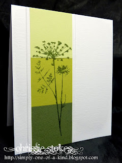
This gorgeous image from Inkadinkado was simply stamped over three toning pieces of green card.
Simplicity itself.
No stamping at all here... just a bunch of die-cuts and a heap of embossing.
I love making tiles from layers of card... stamped, embossed and inked... and here are some!
It's magic how the images appear after the embossed, Versamark images have ink daubed over them.
The SU sentiment is mounted on a slightly reduced size Nestie rectangle.
I thought I'd finish this week with another Hawaiian cruise photo. I had intended to take my specs off, but kind of forgot.
It was a great cruise... here's to the next one... we do have one booked to the Baltic next year.
Do join in with out challenge this week... I'm on my own again as Mandi my co-creator is still busy with her new business! It will be great to see you..

Saturday, 20 October 2012

Autumn at Less is More

Autumn is here!
Yesterday we went to visit our daughter in Bath and the trees en route were turning beautiful shades of yellow, hopefully the reds and browns will soon appear. I love this time of year... crisp days and bright sunshine... wonderful.
The theme at "Less is More" is just this...
Autumn.
Here are a few cards inspired by this theme!

Simple inking and overstamping.


Autumn Splendour from Stampin' Up.
What a great stamp set.


This one is for the Simon Says Stamp Autumn Leaves Challenge

This one was inspired by Birgit a superb crafter and loyal "Less is More" Participant. The tree die is by Memory Box!
Here's another pic from our recent cruise to Hawaii. We had an amazing time. I just love cruising!
I still need to lose the pounds gained by the fabulous food on board!
Hey Ho!


Saturday, 13 October 2012

Back from Hawaii to Week 89 at LIM, Wings

Home again after a month away on a fabulous holiday to California and Hawaii!
We planned this cruise quite some time ago... two weeks to Hawaii and back from Los Angeles. Going all that way, my husband thought we should profit from the fact that we had taken a long flight and extend our stay to include some additional time in California. We actually also strayed into Nevada to visit Las Vegas and the Grand Canyon, followed by a week relaxing in Indio, close to Palm Springs, before returning to LA to embark on our cruise aboard the Golden Princess.
Here we are in the National Park on the Big Island beside some of the steam vents near to the volcano.

It was a wonderful holiday, but quite a time to be away from home. I tried to keep up with visiting LIMettes to comment on their contributions to Less is More, but the Internet connections were not always wonderful, particularly on board ship. SO... many apologies to all of those whose blogs I didn't manage to visit.
I DID manage to find a 'Michael's', the craft store I had read so much about in many American crafter's blogs, and managed to pick up a few bargains.

Now back to Less is More!
We have been astounded by the difference in the attitude of crafters to the One Layer Card challenges at Less is More. At the outset of our blog, they were met with fear and trepidation, but these days many people really seem to enjoy the challenge and the work produced is astounding!
Here is my first sample for this week.
I love this bird stamp from The Rubber Stamp Gallery. It was stamped then masked before the oval was inked in shades of blue, then overstamped with the various birthday sentiments.
The stamps here are all from Stampin' Up. More stamping and masking again here, with the sentiment added a second time as the original was a little wonky!
To make this card, I masked off the square and then inked it with three colours of ink. When dry, I stamped the images with Versamark and then clear embossed them. The darker shades of ink were then sponged over the stamping. I really like the effect.
There we go, three different kind of wings! Job done!

Saturday, 6 October 2012

Week 88 at LIM Colour Challenge

This may seem a little like a continuation from last week, but this time the focus of my cards is the colour silver. For this I used the Stampin' Up set Love and Laughter, mounted on Nesties and with a little Cuttlebugged embossing on the background panel. As the folder is not quite long enough to stretch from one side to the other on this card (150mm x 150mm) I embossed from each edge and left a gap in the middle which is hidden behind the central motif.
It may seem slightly odd to see an anniversary card dedicated to just one person, but this card is a commission from her husband. It seems a little ironic that the font I use so often for wedding and anniversary cards is called 'Passions Conflict.' I hope there isn't too much of that in these marriages!
A new home card next... Memory Box's attic key mounted on a Cuttlebug mesh embossed panel, in turn on a silver mount. The sentiment is from Stampin' Up.
Do have a great week everyone.